skeleton - Panel API
@types IPublicApiSkeleton
> @since v1.0.0
Module Overview
The panel API provides panel extension and management. The blue areas in the image below are all extensions.
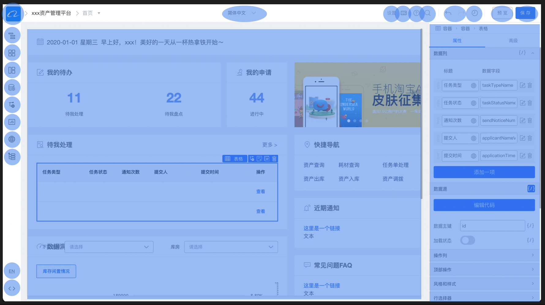
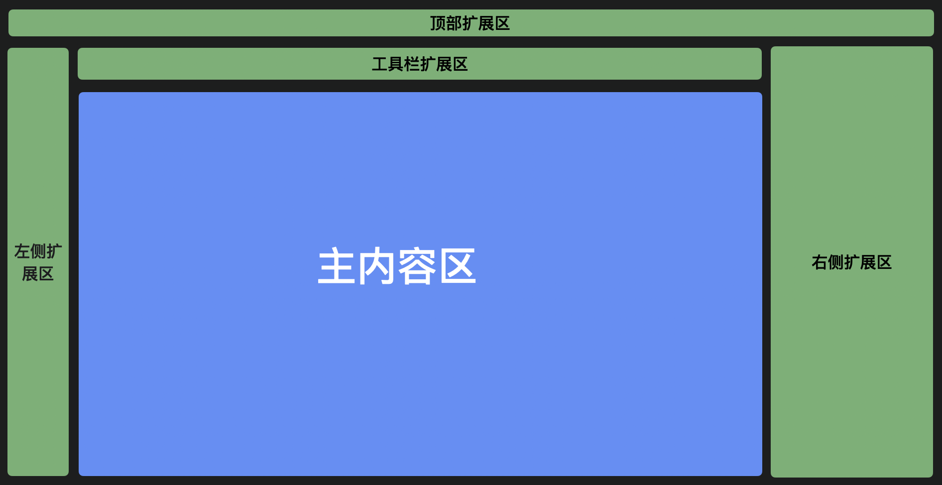
There are 5 extensible areas on the page:
Core Concepts
Extension area (area)
topArea
Top area of the designer. Common plugins here include:
- Designer logo
- Undo/redo buttons
- Global actions such as save and preview
leftArea
Left area is usually icons with corresponding panels. Clicking an icon shows that panel and hides others.
Common plugins here include:
- Outline tree showing the page structure
- Component library — drag components from the panel onto the canvas
- Data source panel
- JS and other code panels
Panels in this area usually do not need to be open at the same time and often need a larger dedicated area for interaction.
centerArea
Canvas area. Extensions here are relatively rare since the canvas is mostly for display. Common extensions include:
- Canvas size controls
- Material selection extension areas
rightArea
Right area, commonly used for component configuration. Common extensions include uniformly adding or removing configuration items across components.
toolbar
Similar to topArea — place panel plugins as needed.
Display type (type)
Display type distinguishes different UI patterns plugins can use in the designer. Main types are PanelDock, Widget, and Dock. Panel is currently not recommended.
PanelDock
PanelDock appears as a panel in the left area. It consists of an icon and a panel; clicking the icon toggles panel visibility.
Below is the component library plugin display.
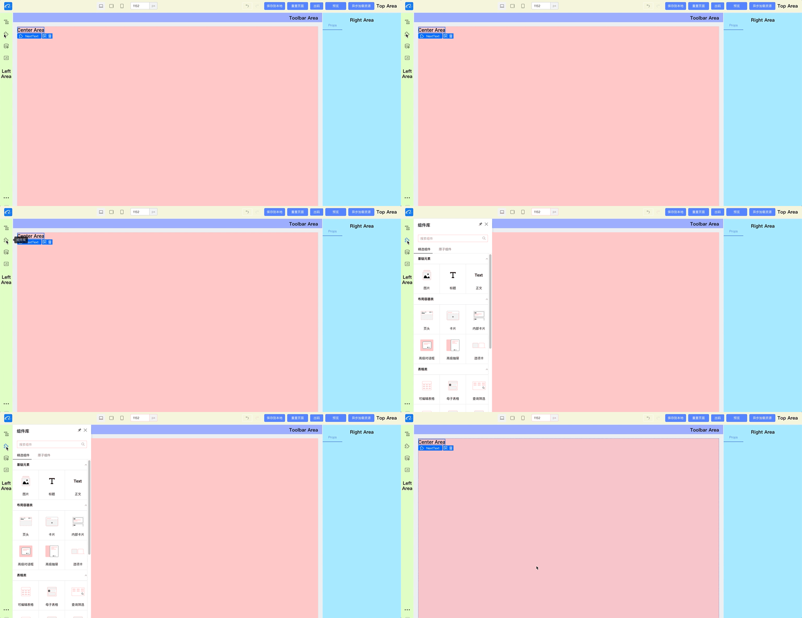
The top-right corner supports pinning and setting popup width.
Integration example:
import { skeleton } from '@rchh/lowcode-engine';

skeleton.add({
  area: 'leftArea', // Plugin area
  type: 'PanelDock', // Plugin type — popup panel
  name: 'sourceEditor',
  content: SourceEditor, // Plugin component instance
  props: {
    align: 'left',
    icon: 'wenjian',
    title: 'Title', // Title shown below the icon
    description: 'JS panel',
  },
  panelProps: {
    floatable: true, // Whether the panel can float
    height: 300,
    hideTitleBar: false,
    maxHeight: 800,
    maxWidth: 1200,
    title: 'JS panel',
    width: 600,
  },
});
Widget
Widget renders directly at the corresponding position in the editor. In the demo, all components in the top area use this pattern.

Integration example:
import { skeleton } from '@rchh/lowcode-engine';
// Register logo panel
skeleton.add({
  area: 'topArea',
  type: 'Widget',
  name: 'logo',
  content: Logo, // Widget component instance
  contentProps: {
    // Widget plugin props
    logo: 'https://img.alicdn.com/tfs/TB1_SocGkT2gK0jSZFkXXcIQFXa-66-66.png',
    href: '/',
  },
  props: {
    align: 'left',
    width: 100,
  },
});
Dock
An icon-only display suitable for language switching, external links, opening a widget, and similar scenarios.
import { skeleton } from '@rchh/lowcode-engine';

skeleton.add({
  area: 'leftArea',
  type: 'Dock',
  name: 'opener',
  props: {
    icon: Icon, // Icon component instance
    align: 'bottom',
    onClick: function () {
      // Open external link
      window.open('https://lowcode-engine.cn');
      // Show widget
      skeleton.showWidget('xxx');
    },
  },
});
Methods
add
Add a panel to a specified extension area
/**
 * Add a panel instance
 * add a new panel
 * @param config
 * @param extraConfig
 * @returns
 */
add(config: IPublicTypeWidgetBaseConfig, extraConfig?: Record<string, any>): any;
IWidgetBaseConfig definition:
| Property | Description | Notes |
|---|---|---|
| name | Panel name | |
| area | Extension area: 'topArea' | 'leftArea' | 'rightArea' | 'toolbar' | 'bottomArea' | 'mainArea' | |
| type | Panel type: 'Widget' | 'PanelDock' | 'Panel' | Dock | See Display type above |
| content | Panel implementation class/node — ReactClass | ReactElement | |
| props | Panel properties | align: 'top' | 'bottom' | 'left' | 'center' | 'right'; // Icon position icon: string | ReactElement; // When icon is a string, ensure the current Fusion theme includes it description: string; condition: Function; // Controls panel visibility |
| contentProps | Props for the panel implementation class/node | |
| panelProps | Valid when type is 'Panel' | 'PanelDock'; passed to Panel | keepVisibleWhileDragging: boolean; // Keep panel open while dragging inside it; default false area: 'leftFloatArea' | 'leftFixedArea' // Float or pinned panel |
| index | Panel position; defaults to plugin registration order |
remove
Remove a panel instance
/**
 * Remove a panel instance
 * remove a panel
 * @param config
 * @returns
 */
remove(config: IPublicTypeWidgetBaseConfig): number | undefined;
getPanel
Get a panel instance
/**
 * Get a panel instance
 * @param name Panel name
 */
getPanel(name: string): IPublicModelSkeletonItem | undefined;
Related type: IPublicModelSkeletonItem
@since v1.1.10
showPanel
Show a panel instance by name
/**
 * Show a panel instance by name
 * show panel by name
 * @param name
 */
showPanel(name: string): void;
hidePanel
Hide a panel
/**
 * Hide a panel
 * hide panel by name
 * @param name
 */
hidePanel(name: string): void;
showWidget
Show a widget instance by name
/**
 * Show a widget instance by name
 * show widget by name
 * @param name
 */
showWidget(name: string): void;
enableWidget
Enable a widget.
/**
 * Enable a widget
 * enable widget
 * @param name
 */
enableWidget(name: string): void;
hideWidget
Hide a widget instance by name.
/**
 * Hide a widget instance by name
 * hide widget by name
 * @param name
 */
hideWidget(name: string): void;
disableWidget
Disable a widget; all mouse events are blocked.
Use case: disable the panel during initialization to prevent user clicks from causing errors, then re-enable when ready.
/**
 * Disable a widget; all mouse events are blocked.
 * disable widget,and make it not responding any click event.
 * @param name
 */
disableWidget(name: string): void;
showArea
Show an area
/**
 * Show an area
 * show area
 * @param areaName name of area
 */
showArea(areaName: string): void;
hideArea
Hide an area
/**
 * Hide an area
 * hide area
 * @param areaName name of area
 */
hideArea(areaName: string): void;
getAreaItems
Get all panel instances in an area
/**
  * Get all panel instances in an area
  * @param areaName IPublicTypeWidgetConfigArea
  */
getAreaItems(areaName: IPublicTypeWidgetConfigArea): IPublicModelSkeletonItem[] | undefined;
Related type: IPublicModelSkeletonItem
registerConfigTransducer
Register a panel configuration transducer.
/**
 * Register a panel configuration transducer.
 * Registers a configuration transducer for a panel.
 * @param {IPublicTypeConfigTransducer} transducer
 *   - Transducer function to register. Accepts a configuration object (IPublicTypeSkeletonConfig) and returns the modified configuration.
 *   - The transducer function to be registered. This function takes a configuration object
 *
 * @param {number} level
 *   - Transducer priority. Higher priority transducers run first.
 *   - The priority level of the transducer. Transducers with higher priority levels are executed first.
 *
 * @param {string} [id]
 *   - (Optional) Unique transducer identifier for referencing or manipulating a specific transducer.
 *   - (Optional) A unique identifier for the transducer. Used for referencing or manipulating a specific transducer when needed.
 */
registerConfigTransducer(transducer: IPublicTypeConfigTransducer, level: number, id?: string): void;
Usage example
import { IPublicModelPluginContext, IPublicTypeSkeletonConfig } from '@rchh/lowcode-types';

function updatePanelWidth(config: IPublicTypeSkeletonConfig) {
  if (config.type === 'PanelDock') {
    return {
      ...config,
      panelProps: {
        ...(config.panelProps || {}),
        width: 240,
      },
    };
  }

  return config;
}

const controlPanelWidthPlugin = (ctx: IPublicModelPluginContext) => {
  const { skeleton } = ctx;
  (skeleton as any).registerConfigTransducer?.(updatePanelWidth, 1, 'update-panel-width');

  return {
    init() {},
  };
};

controlPanelWidthPlugin.pluginName = 'controlPanelWidthPlugin';
controlPanelWidthPlugin.meta = {
  dependencies: [],
  engines: {
    lowcodeEngine: '^1.2.3', // Plugin requires engine ^1.0.0
  },
};

export default controlPanelWidthPlugin;
Events
onShowPanel
Listen for panel show events
/**
 * Listen for panel show events
 * set callback for panel shown event
 * @param listener
 * @returns
 */
onShowPanel(listener: (paneName?: string, panel?: IPublicModelSkeletonItem) => void): IPublicTypeDisposable;
Related type: IPublicTypeDisposable
onHidePanel
Listen for panel hide events
/**
 * Listen for panel hide events
 * set callback for panel hidden event
 * @param listener
 * @returns
 */
onHidePanel(listener: (paneName?: string, panel?: IPublicModelSkeletonItem) => void): IPublicTypeDisposable;
Related type: IPublicTypeDisposable
onDisableWidget
Listen for widget disable events
/**
 * Listen for widget disable events
 * @param listener
 */
onDisableWidget(listener: (paneName?: string, panel?: IPublicModelSkeletonItem) => void): IPublicTypeDisposable;
Related type: IPublicTypeDisposable
onEnableWidget
Listen for widget enable events
/**
 * Listen for widget enable events
 * @param listener
 */
onEnableWidget(listener: (paneName?: string, panel?: IPublicModelSkeletonItem) => void): IPublicTypeDisposable;
Related type: IPublicTypeDisposable
onShowWidget
Listen for widget show events
/**
 * Listen for widget show events
 * set callback for widget shown event
 * @param listener
 * @returns
 */
onShowWidget(listener: (paneName?: string, panel?: IPublicModelSkeletonItem) => void): IPublicTypeDisposable;
Related type: IPublicTypeDisposable
onHideWidget
Listen for widget hide events
/**
 * Listen for widget hide events
 * set callback for widget hidden event
 * @param listener
 * @returns
 */
onHideWidget(listener: (paneName?: string, panel?: IPublicModelSkeletonItem) => void): IPublicTypeDisposable;
Related type: IPublicTypeDisposable
Usage Examples
import { skeleton } from '@rchh/lowcode-engine';

skeleton.add({
  name: 'logo',
  area: 'topArea',
  type: 'Widget',
  contentProps: {},
  content: LogoContent,
});

skeleton.add({
  name: 'sourceEditor',
  type: 'PanelDock',
  area: 'leftArea',
  props: {
    align: 'top',
    icon: 'wenjian',
    description: 'JS panel',
  },
  panelProps: {
    floatable: true,
    height: 300,
    help: undefined,
    hideTitleBar: false,
    maxHeight: 800,
    maxWidth: 1200,
    title: 'JS panel',
    width: 600,
  },
  content: SourceEditor,
});

// Show/hide panel
skeleton.showPanel('sourceEditor');
skeleton.hidePanel('sourceEditor');

// Create a floating widget
skeleton.add({
  name: 'floatingWidget',
  type: 'Widget',
  area: 'mainArea',
  props: {},
  content: React.createElement('div', {}, 'haha'),
  contentProps: {
    style: {
      position: 'fixed',
      top: '200px',
      bottom: 0,
      width: 'calc(100% - 46px)',
      'background-color': 'lightblue',
    },
  },
});

// Show/hide widget
skeleton.showWidget('floatingWidget');
skeleton.hideWidget('floatingWidget');

// Control widget clickability
skeleton.enableWidget('sourceEditor');
skeleton.disableWidget('sourceEditor');
bottomArea example
import { skeleton } from '@rchh/lowcode-engine';

skeleton.add({
  name: 'bottomAreaPanelName',
  area: 'bottomArea',
  type: 'Panel',
  content: () => 'demoText',
});

skeleton.showPanel('bottomAreaPanelName');
widget example
// Register logo panel
skeleton.add({
  area: 'topArea',
  type: 'Widget',
  name: 'logo',
  content: Logo,
  contentProps: {
    logo: 'https://img.alicdn.com/imgextra/i4/O1CN013w2bmQ25WAIha4Hx9_!!6000000007533-55-tps-137-26.svg',
    href: 'https://lowcode-engine.cn',
  },
  props: {
    align: 'left',
  },
});