5. Canvas Details
Component operations
Canvas interactions
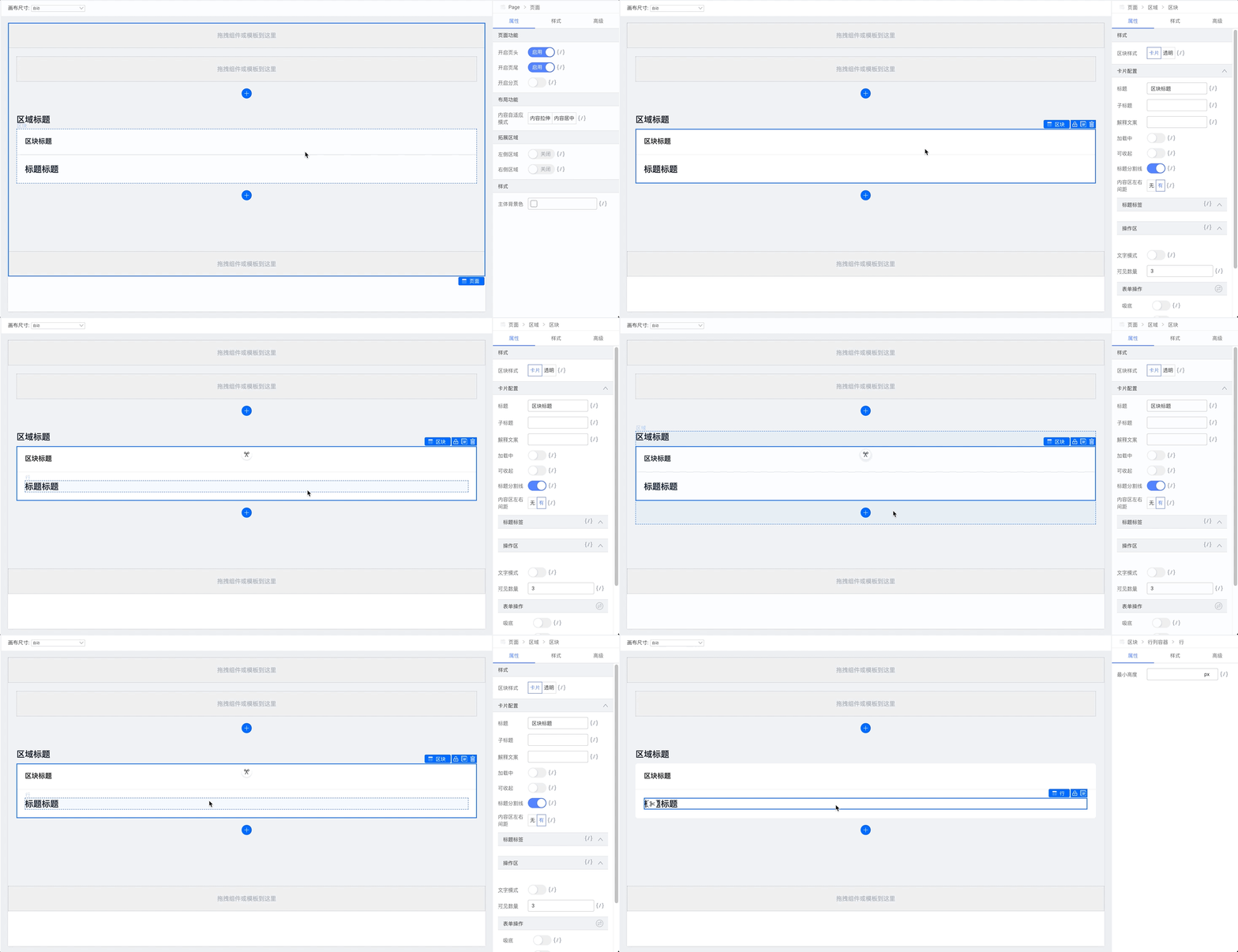
Click a component to show its properties in the right panel.
Drag to reorder components.
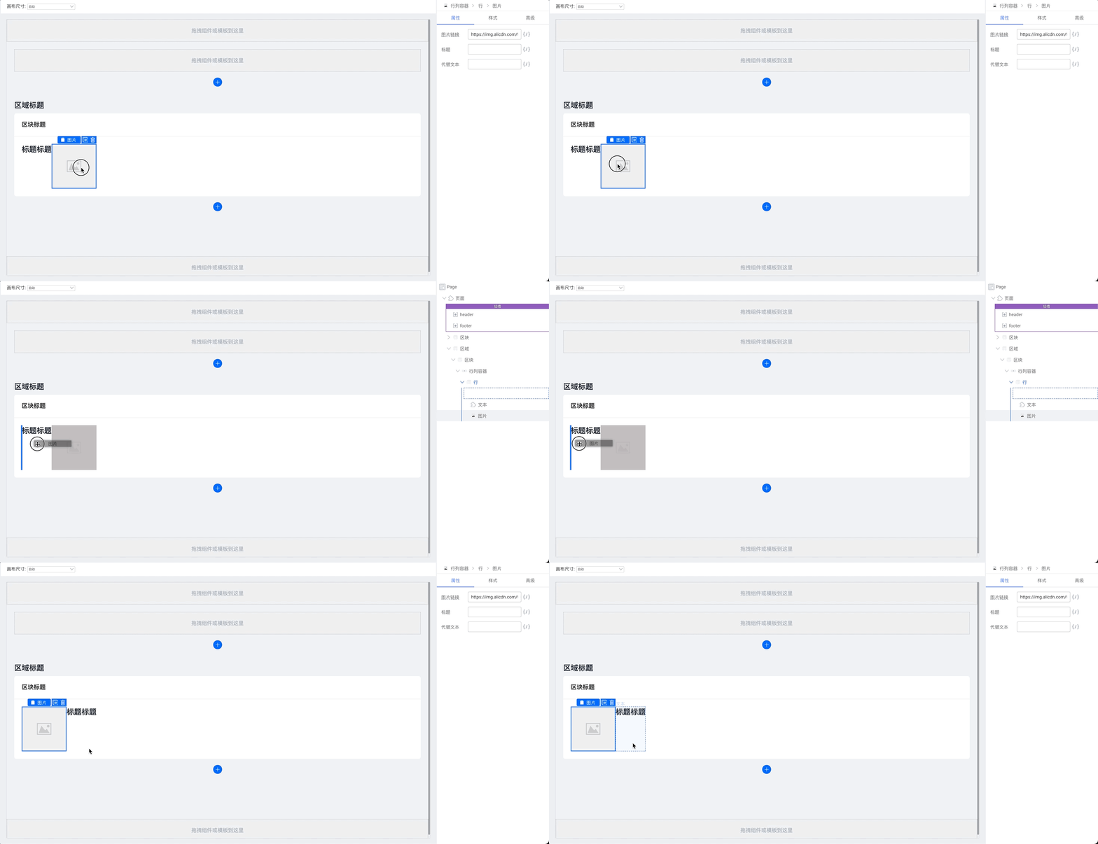
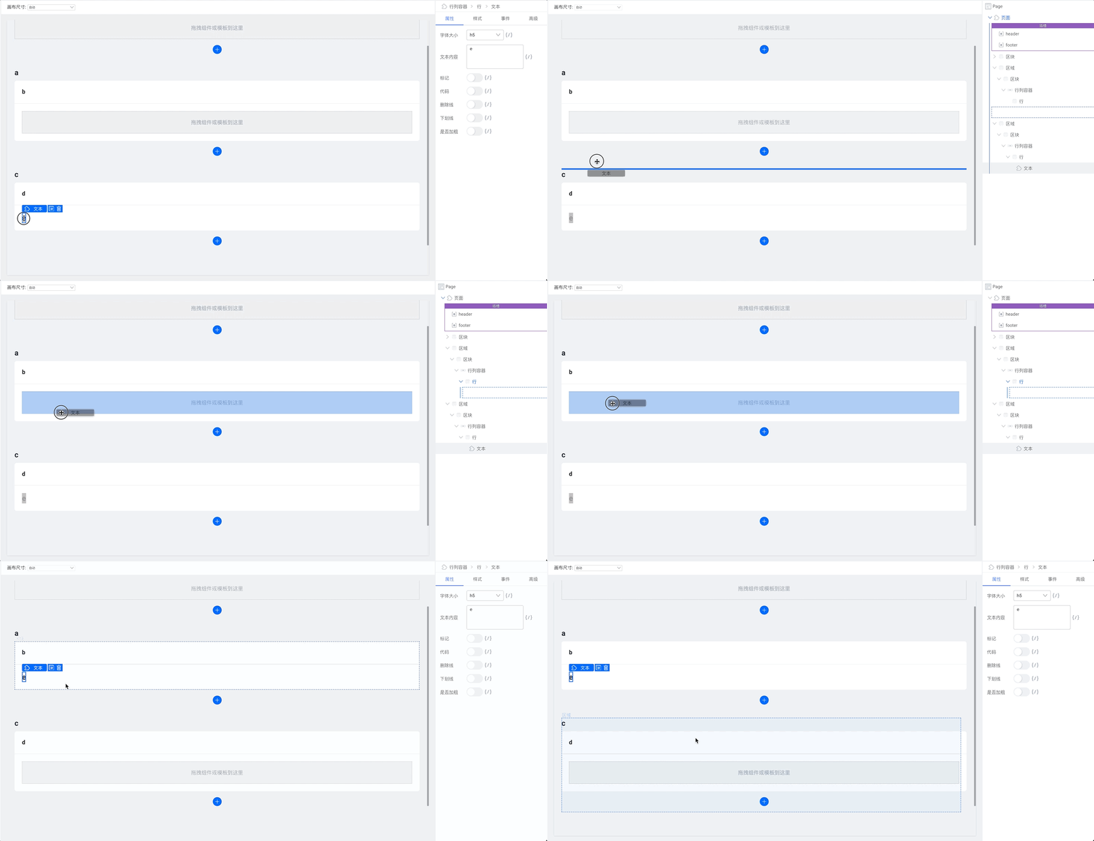
While dragging, the component tree is shown on the right.
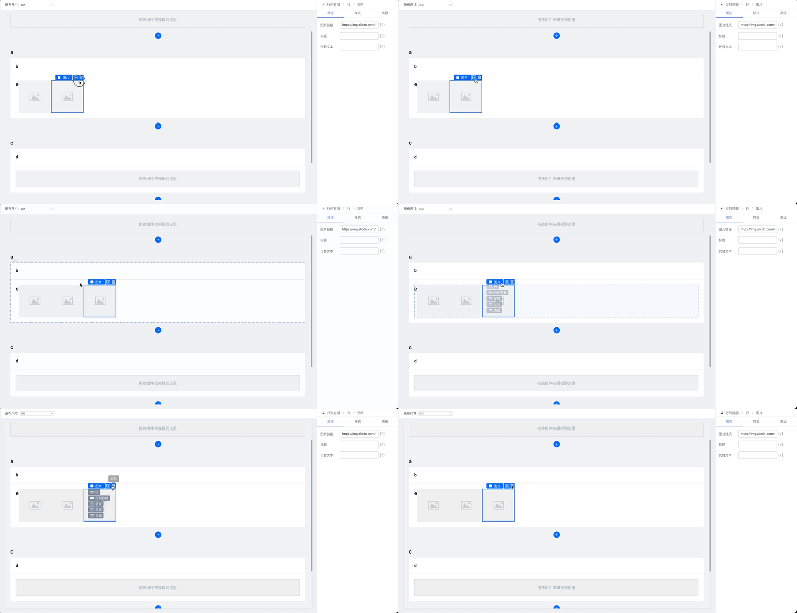
Component controls
Use the copy button or ctrl + c then ctrl + v to duplicate.
Use the delete button or Delete to remove.
Changing selection
Use arrow keys to move selection:
↑select component above↓select component below←select component to the left→select component to the right
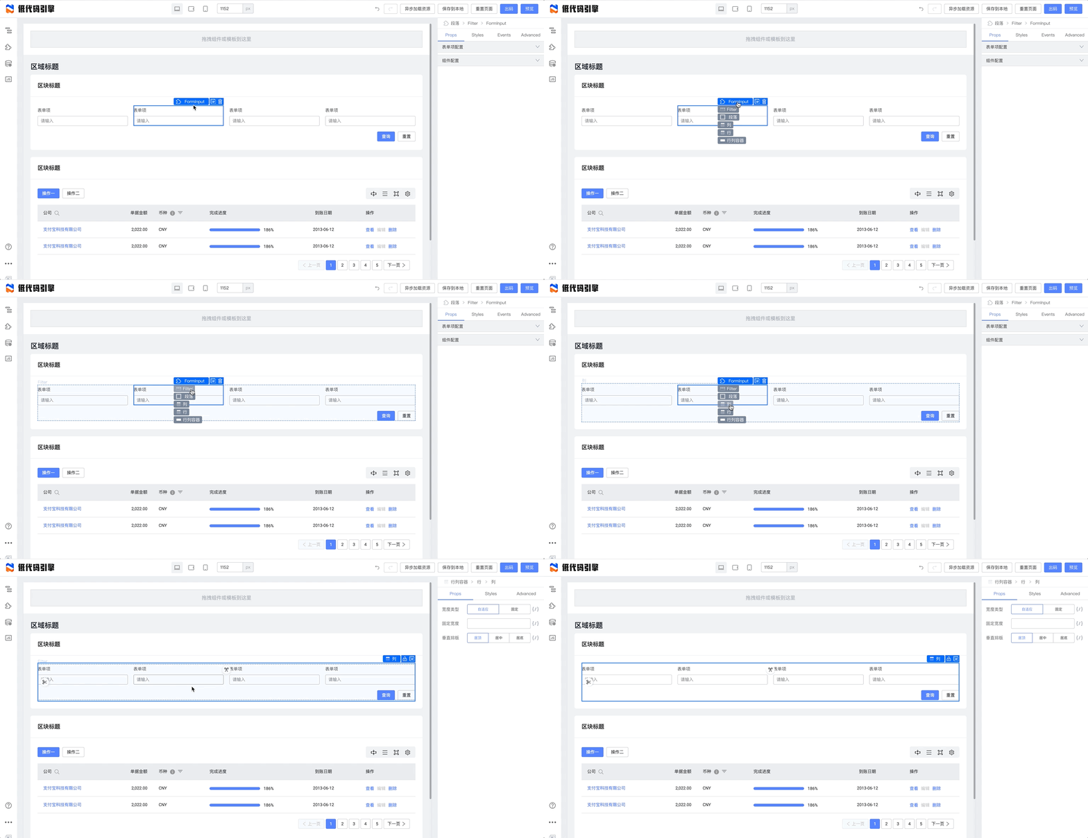
Hover the first item in the component action bar to select the parent:
Extensibility
Shortcuts and the action bar can be extended.
Slot regions
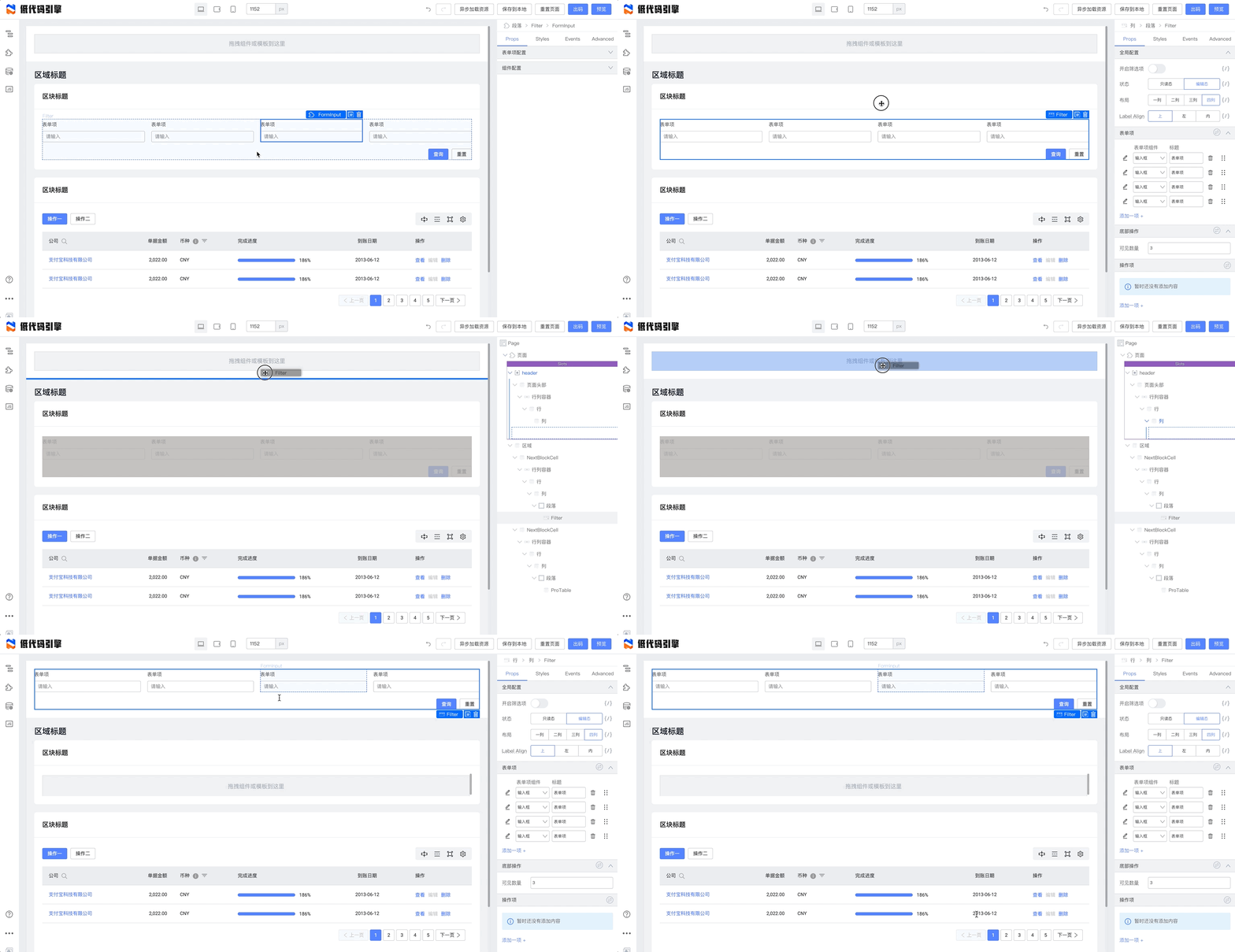
In React, a prop can be JSXElement or (...args) => JSXElement. In the low-code canvas this is a Slot—you can drop components inside for intuitive composition.
Lock a Slot
Lock a Slot so inner content cannot be selected:
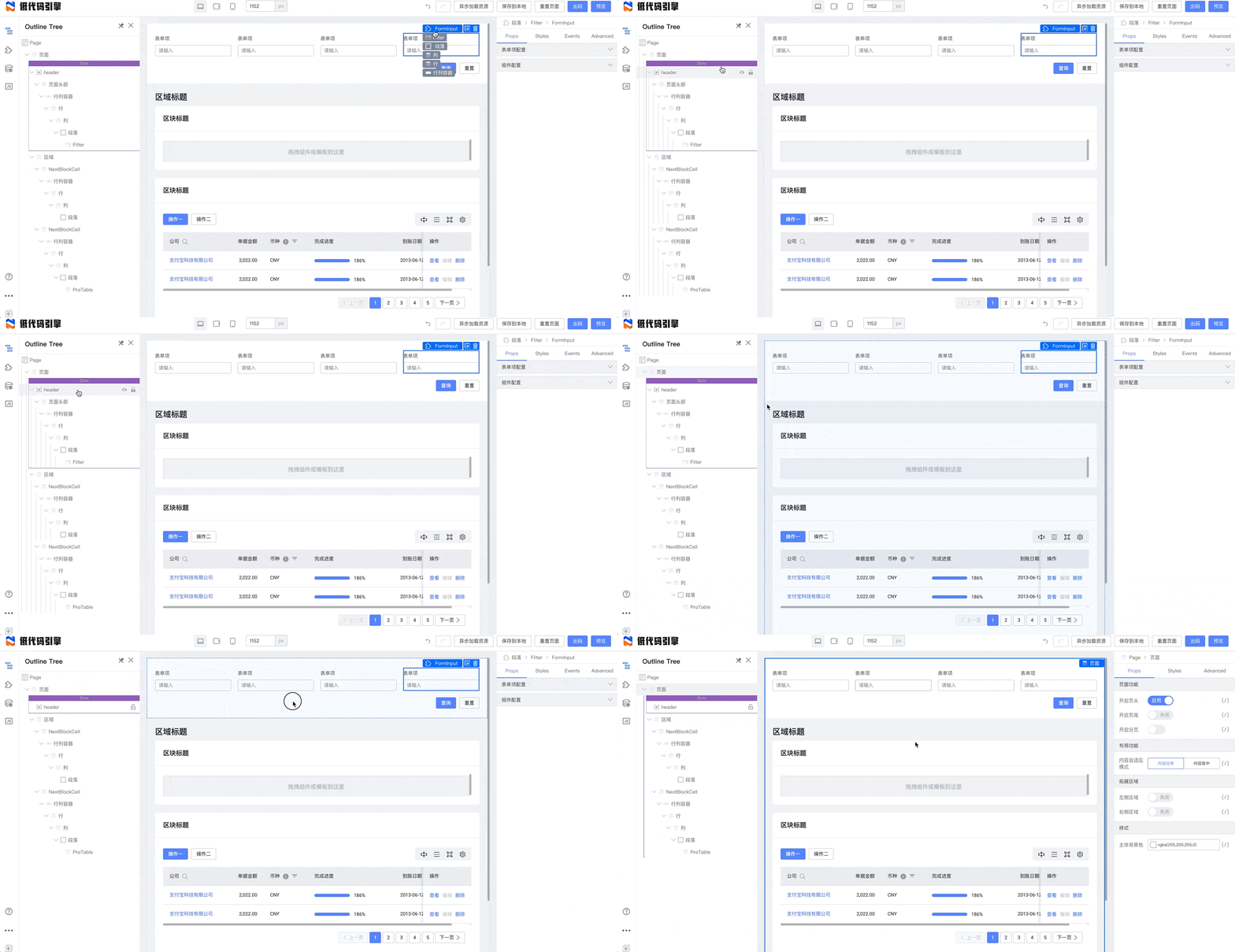
Unlock from the component tree.
Design mode
The engine lets components behave differently while editing. The Demo layout components use this API for advanced layout editing.
Two approaches:
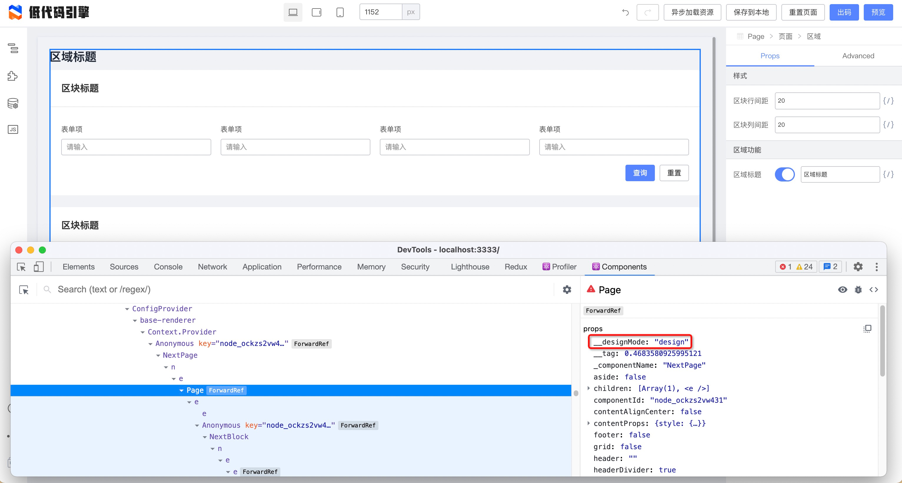
- Intrusive: in design mode the engine passes
__designMode: 'design'into the component:
- Dual entry: configure
editUrlson the material to load design-only bundles.pro-layoutuses this:
{
  "package": "@alifd/pro-layout",
  "version": "1.0.1-beta.6",
  "library": "AlifdProLayout",
  "urls": [
    "https://alifd.alicdn.com/npm/@alifd/pro-layout@1.0.1-beta.6/dist/AlifdProLayout.js",
    "https://alifd.alicdn.com/npm/@alifd/pro-layout@1.0.1-beta.6/dist/AlifdProLayout.css"
  ],
  "editUrls": [
    "https://alifd.alicdn.com/npm/@alifd/pro-layout@1.0.1-beta.6/build/lowcode/view.js",
    "https://alifd.alicdn.com/npm/@alifd/pro-layout@1.0.1-beta.6/build/lowcode/view.css"
  ]
}