4. Component Panel Details
Overview
The component panel lists components from the asset package passed to the low-code engine (schema reference). It parses that data, applies grouping and sort rules, and supports search.
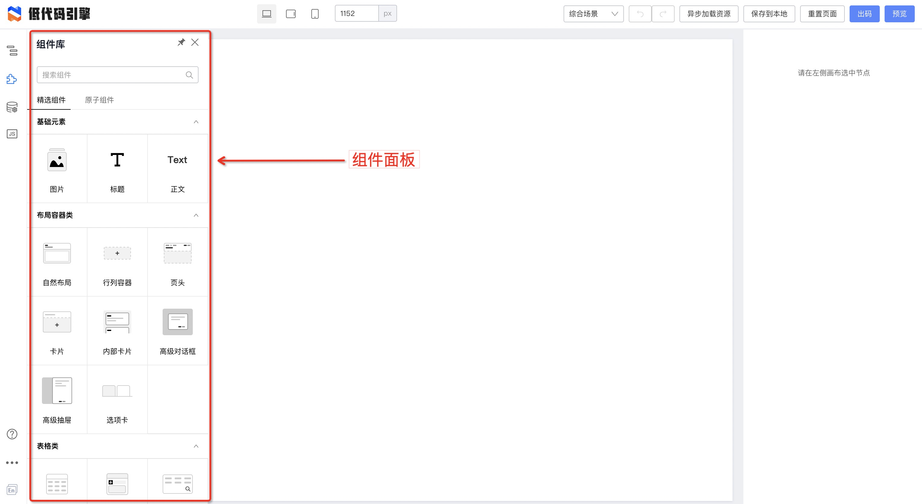
Component metadata
Each entry includes:
- Component title
- Screenshot
- Low-code schema snippet (inserted on drag)
- Group
- Category
- Hidden flag
- Keywords: used for search; aggregates
name,title,description,keywords, etc.
Title and screenshot are visible in the UI; the schema snippet is inserted into the page schema on drop. Grouping and category control layout. Fields map from the asset package as shown:
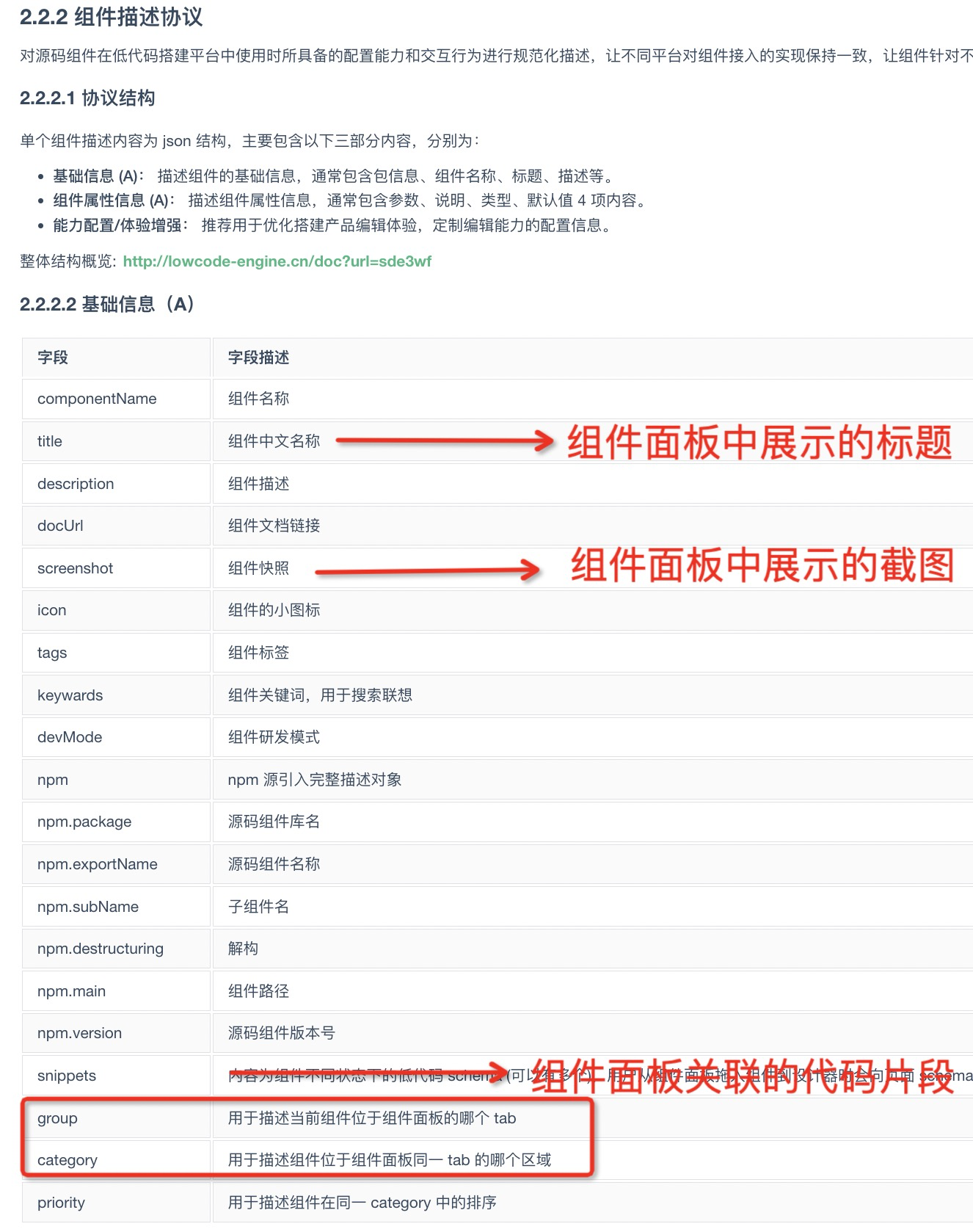
Group, category, and sort order
Same group → same tab; same category → same collapse section. Tab and collapse order are configurable.
Component metadata alone cannot define global order, so the asset root has a sort field—see Low Code Engine Asset Package Specification section 2.4:
| Root property | Type | Description | Variable support | Default |
|---|---|---|---|---|
| sort.groupList | String[] | Component groups (panel tabs) | - | ['Featured Components', 'Atomic Components'] |
| sort.categoryList | String[] | Categories within a tab; order follows categoryList | - | ['General', 'Data Display', 'Tables', 'Forms'] |
Search
Search matches name, title, description, keywords, and related fields. You can add keywords as a string or array for extra search terms.