Material Extension
Material Overview
Materials are the building blocks of pages. By granularity, they can be divided into components, blocks, and templates:
- Component: The smallest reusable unit for page building. It only exposes configuration options; users do not need to know its internal implementation.
- Block: A small piece of schema that conforms to the low-code protocol. It contains one or more components internally. After dragging a block into the designer, users can freely modify its internal content.
- Template: Similar to a block, a template is also a piece of schema that conforms to the low-code protocol. However, its root node's
componentNamemust be fixed asPage. It is often used to initialize a page.
Materials in the low-code editor require certain configuration and processing before users can use them on the low-code platform. This process requires a configuration file—the asset bundle. In the asset bundle file, each material is defined with its usage description in the low-code editor.
Asset Bundle Configuration
What Is a Low-Code Asset Bundle
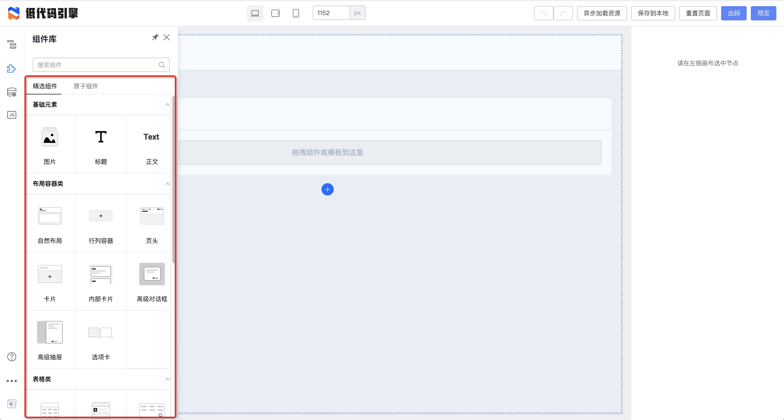 In the low-code Demo, we can see that the component panel does not provide just a single component. Components are provided to the low-code platform as a collection, and the low-code asset bundle is the form in which these components make up a collection.
Its underlying Interface is excerpted from the engine definition as follows:
In the low-code Demo, we can see that the component panel does not provide just a single component. Components are provided to the low-code platform as a collection, and the low-code asset bundle is the form in which these components make up a collection.
Its underlying Interface is excerpted from the engine definition as follows:
export interface Assets {
  version: string; // Asset package protocol version
  packages?: Array<Package>; // Package list; external and package concepts are merged
  components: Array<ComponentDescription> | Array<RemoteComponentDescription>; // List of all component description protocols
  sort: ComponentSort; // New field describing tabs and categories in the component panel
}

export interface ComponentSort {
  groupList?: String[]; // Tab items and order in the component panel, e.g.: ["Featured Components", "Atomic Components"]
  categoryList?: String[]; // Within the same tab, sections are split by category; category order follows categoryList;
}

export interface RemoteComponentDescription {
  exportName: string; // Exported component description name; access via window[exportName];
  url: string; // Component description resource URL;
  package: {
    // npm info of the component (library);
    npm: string;
  };
}
Asset bundle protocol TypeScript description
Asset Bundle in the Demo
The Demo project includes a default asset bundle:
https://github.com/alibaba/lowcode-demo/blob/main/demo-general/src/services/assets.json
The materials in this asset bundle are curated internally. Users can experience the building and configuration capabilities provided by the engine through this asset bundle.
Register the asset bundle normally in a project:
import { material } from '@rchh/lowcode-engine';
// Import assets in any way
material.setAssets(assets);
Register the asset bundle with debug support:
With this approach, after starting and deploying the project, you can debug local materials by adding
?debugto the preview URL. For example:
- Initialize a material through a plugin
- Configure the material for debugging according to the reference article
- Start the material
- Visit: https://lowcode-engine.cn/demo/demo-general/index.html?debug
import { material } from '@rchh/lowcode-engine';
import Inject, { injectAssets } from '@rchh/lowcode-plugin-inject';
await material.setAssets(await injectAssets(assets));
Manually Configuring an Asset Bundle
Refer to the basic Fusion Assets definition in the Demo. If we modify assets.json, we can configure the asset bundle:
- packages object: Define how this package is obtained. If not defined, it will not be dynamically loaded by the low-code engine and mapped to component instances. For UMD packages, the low-code engine will try to find the corresponding library instance on
window. - components object: Define material descriptions. Material descriptions are covered in the next section.
Material Description Configuration
What Is a Material Description
In a low-code platform, users vary—they may be developers, testers, operators, designers, or roles such as sales, administration, HR, and so on. Most of them do not have professional front-end development knowledge. The workflow for using components on a low-code platform is as follows:
- The user drags/selects a component and sees it on the canvas;
- After selecting the component, its configuration options appear;
- The user modifies the component configuration options;
- The canvas updates accordingly.
When we select a component, we can see the component's configuration options displayed on the right panel.
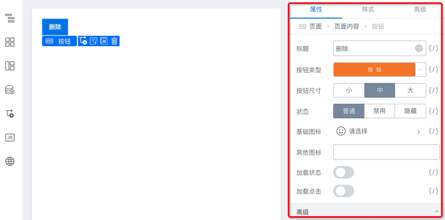 It includes the following:
- Basic information: Describes basic component information, usually including package info, component name, title, description, etc.
- Component property information: Describes component properties, usually including parameter, description, type, and default value.
- Capability configuration / experience enhancement: Recommended for optimizing the editing experience of the building product and customizing editing capabilities.
Therefore, we designed the 《Low-Code Component Description Protocol for Admin Applications》 to describe what can be configured in a low-code editor.
Material Descriptions in the Demo
From the Demo's assets.json, we can find the following three material descriptions:
@alifd/pro-layout: Layout component, placed inwindow.AlifdProLayoutMeta, meta file URL;@alifd/fusion-ui: Featured components, placed inwindow.AlifdFusionUiMeta, meta file URL;@rchh/lowcode-materials: Atomic components, placed inwindow.AlilcLowcodeMaterialsMeta, meta file URL;
In the engine, the corresponding meta file is loaded and injected globally:
const src = 'https://alifd.alicdn.com/npm/@alifd/pro-layout@1.0.1-beta.5/build/lowcode/meta.js';
const script = document.createElement('script');
script.src = src;
document.head.appendChild(script);
Then the corresponding material description content can be obtained on window:
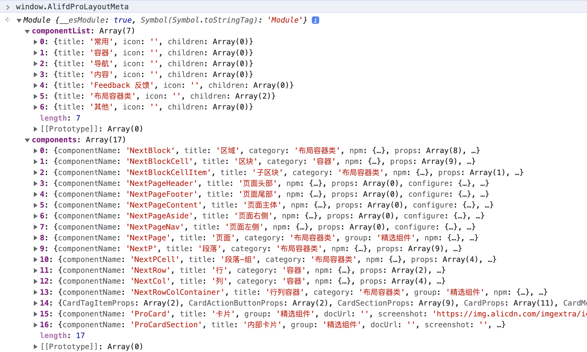 When manually configuring material descriptions, you can use this approach to reference how material descriptions are implemented in the Demo.
Manually Configuring Material Descriptions
See the "Material Description Details" section.
Low-Code Development of Materials
Note: The CLI provided by the engine is not adapted for Windows. On Windows, you must use WSL. Other terminals are not guaranteed to run correctly.
You can use this section to complete the configuration and debugging of a component in the low-code editor.
Preface (Required Reading)
The material development scaffolding provided by the engine includes a built-in material ingestion module. During initialization, it automatically parses the source code into a low-code description. However, the low-code description parsed from source code is not refined enough for direct use, because source code does not contain enough information—it cannot fully cover configuration item interactions.
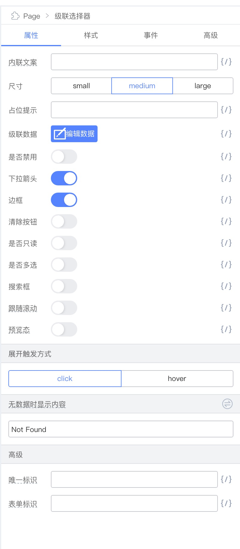 For example, given the design above from a designer, in addition to which props can be configured and which setter configures each prop, it also includes prop aggregation, ordering, and even custom setters. This information is not available in source code and must be developed in the low-code description.
We therefore recommend using the CLI-initialized low-code description only as a starting point. Design configuration items according to user habits, then manually develop and debug the low-code description.
Developing a New Component
Component Project Initialization
npm init @rchh/element your-material-name
Selecting Component Type
Component -> \<Component organization type>
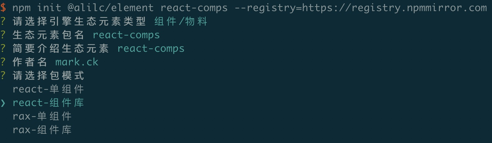 Here we choose react-component library. After that, the component library project is generated with the following directory structure:
my-materials
├── README.md
├── components  (business component directory)
│   ├── ExampleComponent              // Business component 1
│   │   ├── build                     // [build output][required]
│   │   │   └── index.html                      // [build output][required] file that can be previewed directly
│   │   ├── lib                       // [build output][required]
│   │   │   ├── index.js              // [build output][required] JS entry
│   │   │   ├── index.scss            // [build output][required] CSS entry
│   │   │   └── style.js                            // [build output][required] JS-style CSS entry for dedupe
│   │   ├── demo                      // [required] component docs for preview and documentation
│   │   │   └── basic.md
│   │   ├── src                       // [required] component source
│   │   │   ├── index.js              // [required], component export file
│   │   │   └── main.scss             // [required], source file with only this component's styles
│   │   ├── README.md                 // [required], component docs and API
│   │   └── package.json              // [required]
└── └── ExampleComponent2             // Business component 2
Component Development and Debugging
# Install dependencies
npm install

# Start the lowcode env for debug/preview
npm run lowcode:dev

# Build low-code artifacts
npm run lowcode:build
After running the above commands, a lowcode folder is generated in the component (library) root directory, containing the low-code description for each component:
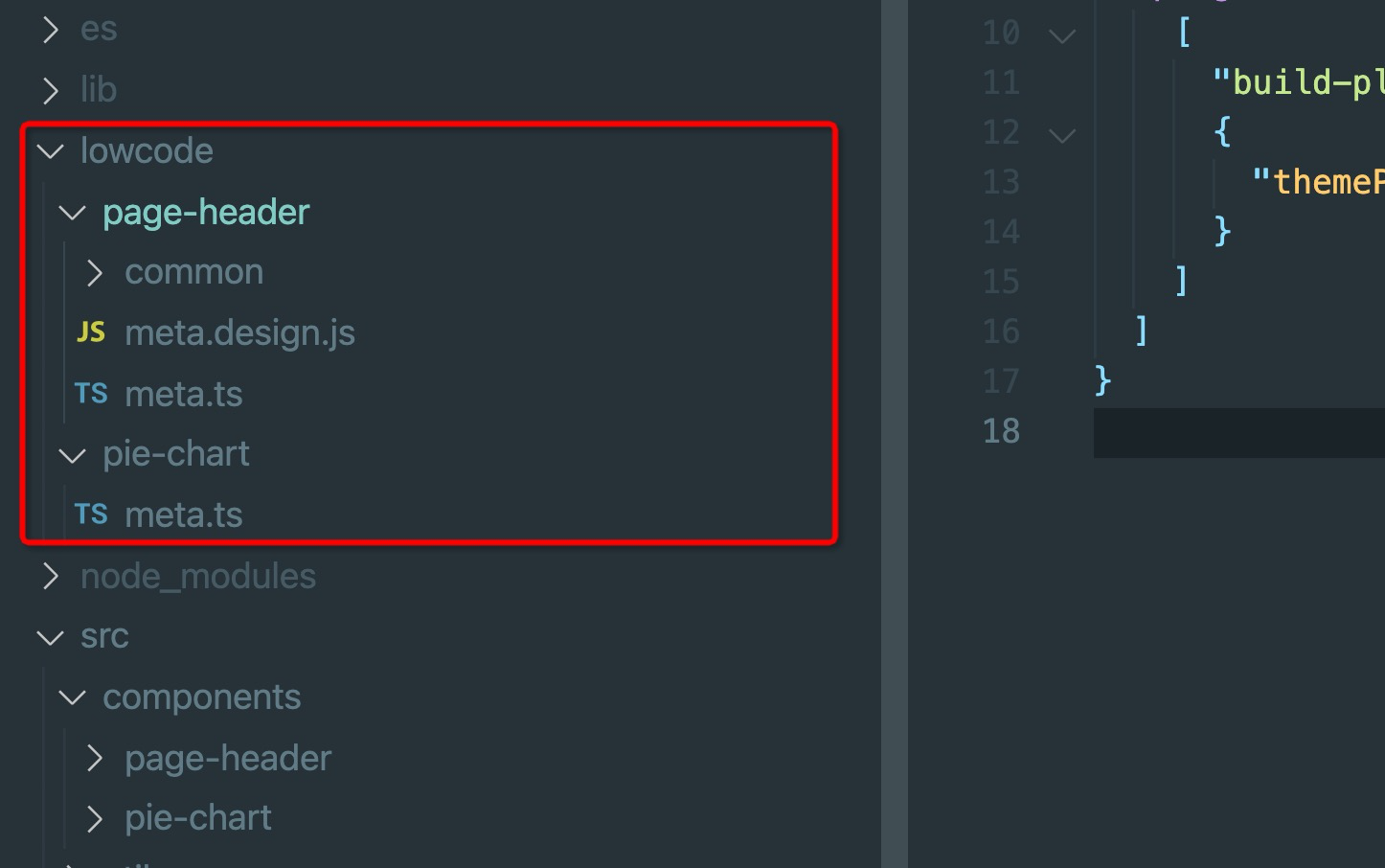
When you add a new component under the src/components directory and export it in src/index.tsx, then run npm run lowcode:dev, the low-code plugin automatically generates the low-code description for the new component in the lowcode/<component-name> directory (meta.ts).
Users can directly modify the low-code description to change component configuration:
- Set component setters (setters introduced in the previous section; custom setters can also be used in materials);
- Add new component configuration items;
- Modify existing configuration items;
Configuration Examples
Hide a prop
{
  name: 'dataSource',
  condition: () => false,
}
Display style
{
  name: 'dataSource',
  display: 'accordion' | 'inline' | 'block' | 'plain' | 'popup' | 'entry', // common values: inline (default), block, entry
}
Edit-Mode View
Users can add a view.tsx under the lowcode/<component-name> directory to add an edit-mode view. The edit-mode view is used to display a view in edit mode that differs from the real preview.
The output of view.tsx is also a React component.
Note: For a single component (not a component library), view.tsx should be placed under lowcode rather than lowcode/<component-name>.
Publishing the Component
# In the component root, run
$ npm publish
Low-Code Conversion of Existing Components
Component low-code conversion means that before introducing a low-code platform, most components were developed as source code components—that is, ProCode components.
After introducing a low-code platform, existing source code components need to be converted into low-code materials so they can be consumed on the low-code platform.
The following explains how to low-code-ify existing source code components.
Configuring the Low-Code Development Environment
In your component development environment, install build-scripts and its low-code development plugin:
npm install -D @alifd/build-plugin-lowcode @alib/build-scripts --save-dev
Add a build-scripts configuration file: build.lowcode.js
module.exports = {
  alias: {
    '@': './src',
  },
  plugins: [
    [
      '@alifd/build-plugin-lowcode',
      {
        engineScope: '@alilc',
      },
    ],
  ],
};
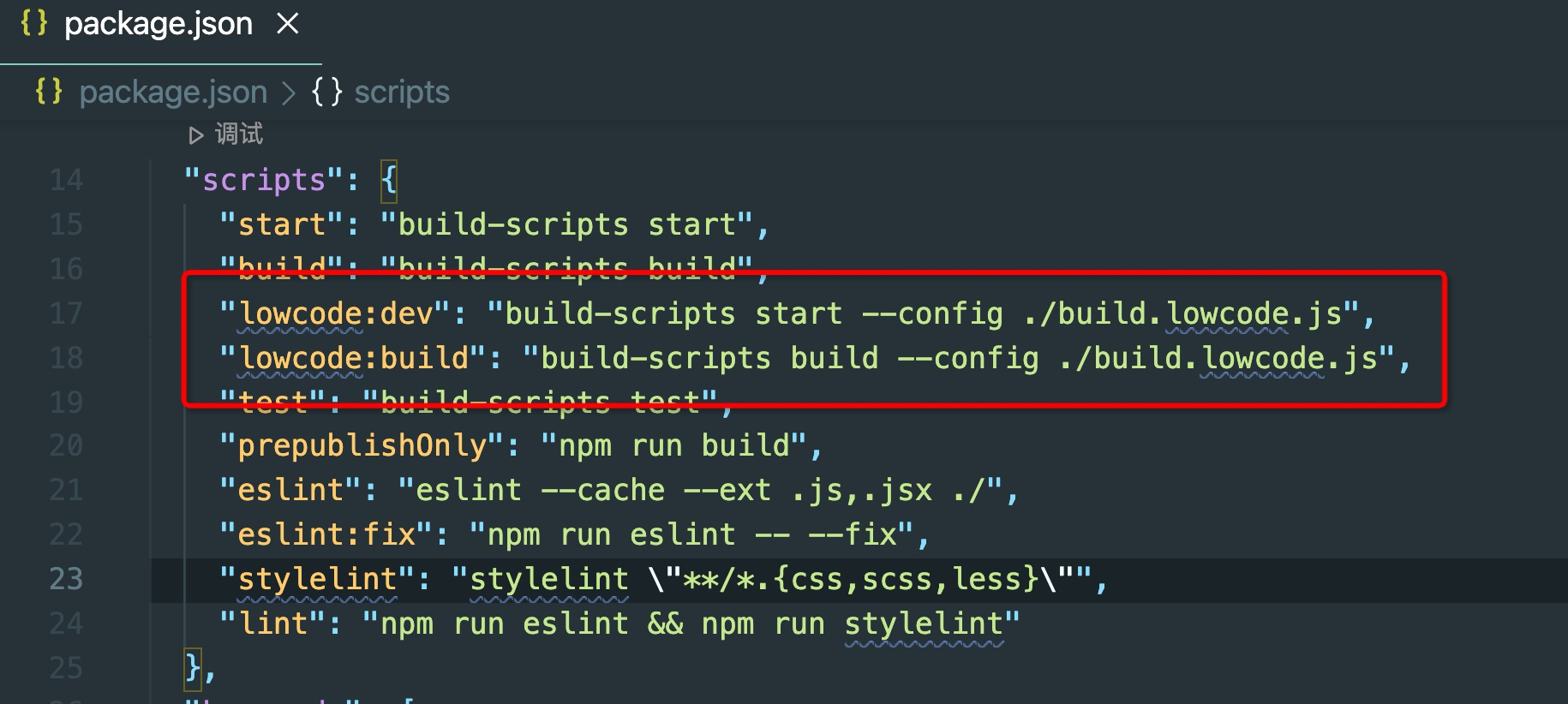
Define low-code development commands in package.json
"lowcode:dev": "build-scripts start --config ./build.lowcode.js",
"lowcode:build": "build-scripts build --config ./build.lowcode.js",
Development and Debugging
# Start the low-code development/debug env
npm run lowcode:dev
Component development remains the same as before, but a new component configuration file is added. The configuration approach is the same as for low-code materials.
Build
# Build low-code artifacts
npm run lowcode:build
Publishing the Component
# In the component root, run
npm publish
Introducing Components (Libraries) in a Project
The following content can be viewed in the 《Alibaba Low-Code Engine Project Practice (3) - Custom Component Integration》 live replay.
For a platform or user, the required set of components may differ. To customize a component collection, you need a custom asset bundle. A custom asset bundle configures a series of components. Use this asset bundle with the engine to use your custom component collection in the engine.
Managing an Asset Bundle
All component-related resources used in a project must be defined in the asset bundle. To use a self-developed component library in a project, simply merge the built resources of the component into assets.json.
Adding Custom Components to the Asset Bundle
After building and publishing a custom component through the official scaffolding, an build/lowcode/assets-prod.json file appears in the npm package. Simply merge the contents of that file into the project's assets.json.
Asset Bundle Hosting
- The simplest approach is like the engine demo project—maintain an
assets.jsonin the project. Adding components or updating component versions requires modifying this asset bundle. - A more flexible approach is to maintain a remotely configurable
assets.jsonvia OSS or similar services. Adding components or updating versions only requires modifying the remote asset bundle; the project does not need to be updated. - An even more advanced approach is to implement an asset bundle management service that allows updating asset bundle content through a user interface.
Introducing the Asset Bundle in a Project
import { material, plugins } from '@rchh/lowcode-engine';
import { IPublicModelPluginContext } from '@rchh/lowcode-types';

// Load assets dynamically
plugins
  .register((ctx: IPublicModelPluginContext) => {
    return {
      name: 'ext-assets',
      async init() {
        try {
          // Replace the links below with your materials, whether via utils from the material center or by importing descriptions directly
          const res = await window.fetch(
            'https://fusion.alicdn.com/assets/default@0.1.95/assets.json',
          );
          const assets = await res.text();
          material.setAssets(assets);
        } catch (err) {
          console.error(err);
        }
      },
    };
  })
  .catch((err) => console.error(err));