Plugin Extension - Panel Extension
Plugin Overview
The plugin system gives the low-code engine greater flexibility. The low-code engine ecosystem provides some official plugins, but they cannot meet everyone's needs, so powerful plugin customization is provided.
Through custom plugins, decoupled from the low-code engine, we can interact with core engine modules to meet diverse requirements. You can not only customize plugin UI but also implement non-UI logic:
- Call APIs provided by the editor framework to perform editor or schema operations;
- Implement plugin initialization logic through plugin lifecycle functions;
- Implement specific slice logic by listening to messages within the editor (such as panel open, panel close, etc.);
This article only covers panel-level extension. For editor plugin extension, see the "Plugin Extension - Orchestration Extension" section.
Plugin Registration API
import { plugins } from '@rchh/lowcode-engine';
import { IPublicModelPluginContext } from '@rchh/lowcode-types';

const pluginA = (ctx: IPublicModelPluginContext, options: any) => {
  return {
    init() {
      console.log(options.key);
      // Add a panel to the engine
      ctx.skeleton.add({
        // See area config below
        area: 'leftArea',
        // See type config below
        type: 'PanelDock',
        content: <div>demo</div>,
      });
      ctx.logger.log('Log a message');
    },
    destroy() {
      console.log('I was destroyed~');
    },
  };
};

pluginA.pluginName = 'pluginA';

plugins.register(pluginA, { key: 'test' });
If you want to learn how to package an extracted plugin as an npm package for the community, see the "Low-Code Ecosystem Scaffolding & Debug Mechanism" section.
Panel Plugin Configuration
Panel plugins act on the designer, mainly displayed in the designer skeleton through buttons, icons, etc. The designer skeleton is divided into the following areas, and most plugins act on these areas.

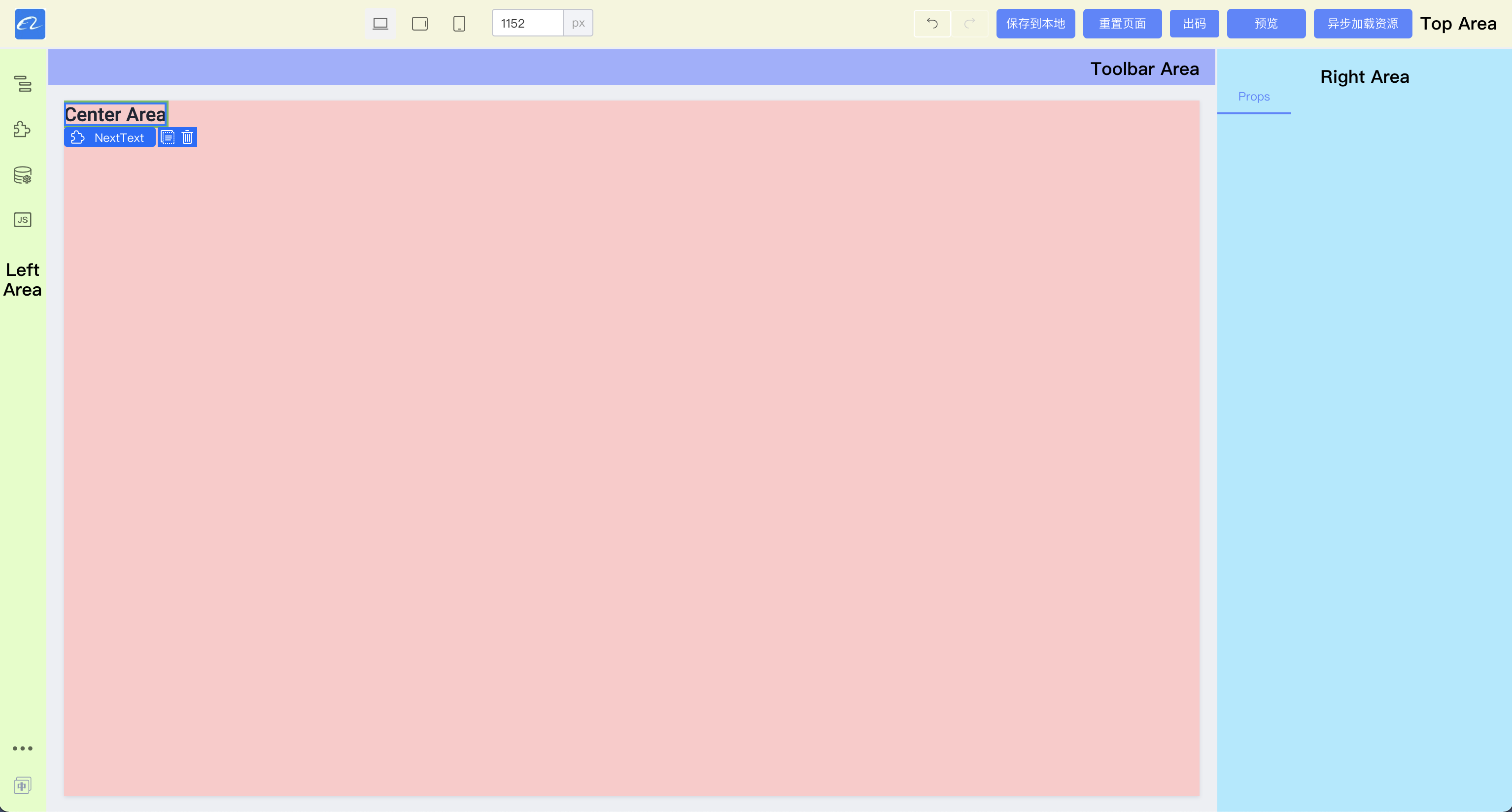
Display Area (area)
topArea
Displayed in the top area of the designer. Common plugins in this area include:
- Register the designer logo;
- Designer undo and redo buttons;
- Global action buttons, such as save, preview, etc.;
leftArea
The left area is mostly displayed as icons and corresponding panels. Clicking an icon shows the corresponding panel and hides others.
Main plugins in this area include:
- Outline tree, showing the outline of the page being designed.
- Component library, showing components registered in the designer. After clicking, components can be dragged from the component library panel onto the designer canvas.
- Data source panel
- JS and other code panels.
Most panels in this area do not need to coexist during operation, and interactions are relatively complex, requiring a larger dedicated area.
centerArea
Canvas area. Since the canvas is mostly for display, there are relatively few extension types. Common extensions include:
- Canvas size modification
- Material selection extension area modification
rightArea
Right area, commonly used for component configuration. Common extensions include: uniformly handling component configuration items, such as uniformly removing a configuration item or uniformly adding a configuration item.
toolbar
Similar to topArea; place panel plugins as needed.
Display Type (type)
PanelDock
PanelDock is displayed as a panel in the left area of the designer. It consists of two parts: an icon and a panel. Clicking the icon controls panel visibility.
The following shows the component library plugin.
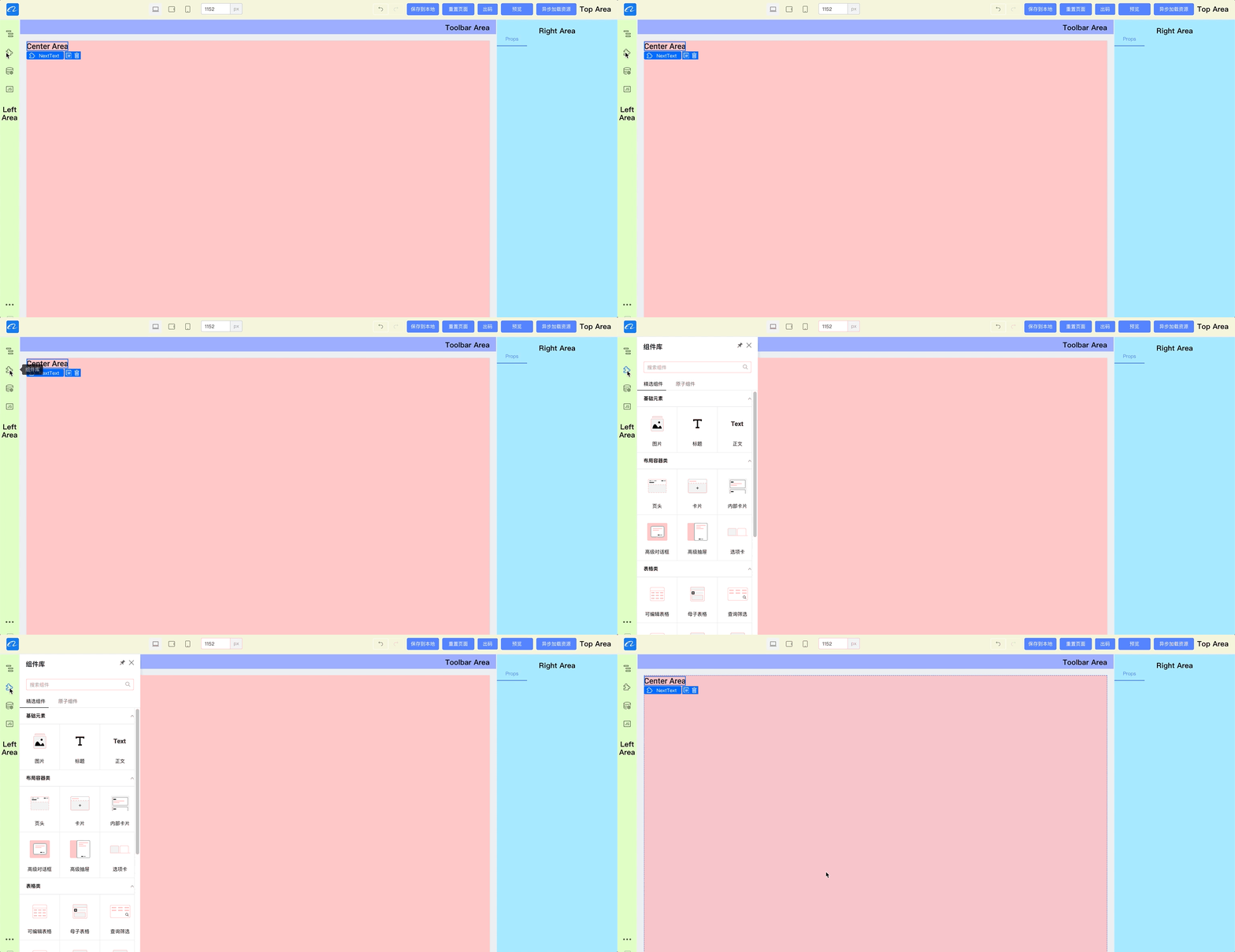
The top-right corner allows pinning and setting the popup width.
Integration reference code:
import { skeleton } from '@rchh/lowcode-engine';

skeleton.add({
  area: 'leftArea', // plugin area
  type: 'PanelDock', // plugin type: popup panel
  name: 'sourceEditor',
  content: SourceEditor, // plugin component instance
  props: {
    align: 'left',
    icon: 'wenjian',
    description: 'JS Panel',
  },
  panelProps: {
    floatable: true, // whether floatable
    height: 300,
    hideTitleBar: false,
    maxHeight: 800,
    maxWidth: 1200,
    title: 'JS Panel',
    width: 600,
  },
});
Widget
Widget is rendered directly at the corresponding position in the current editor. In the demo, all components at the top of the designer use this display form.

Integration reference code:
import { skeleton } from '@rchh/lowcode-engine';
// Register logo panel
skeleton.add({
  area: 'topArea',
  type: 'Widget',
  name: 'logo',
  content: Logo, // Widget component instance
  contentProps: {
    // Widget plugin props
    logo: 'https://img.alicdn.com/tfs/TB1_SocGkT2gK0jSZFkXXcIQFXa-66-66.png',
    href: '/',
  },
  props: {
    align: 'left',
    width: 100,
  },
});
Dock
An icon display form, used for scenarios such as language switching, opening external links, or opening a widget.
import { skeleton } from '@rchh/lowcode-engine';

skeleton.add({
  area: 'leftArea',
  type: 'Dock',
  name: 'opener',
  props: {
    icon: Icon, // Icon component instance
    align: 'bottom',
    onClick: function () {
      // Open external link
      window.open('https://lowcode-engine.cn');
      // Show widget
      skeleton.showWidget('xxx');
    },
  },
});
Panel
Generally not used alone; use through PanelDock.
Real-World Examples
Page Management Panel
- Repository: https://github.com/mark-ck/lowcode-portal
- Source code: https://github.com/mark-ck/lowcode-portal/blob/master/src/plugins/pages-plugin/index.tsx
- Live replays:
- Low-Code Engine Project Practice (4) - Custom Plugin - Page Management
- Low-Code Engine Project Practice (4) - Custom Plugin - Page Management - Backend
- Low-Code Engine Project Practice (4) - Custom Plugin - Page Management - Frontend
- Low-Code Engine Project Practice (4) - Custom Plugin - Page Management - Conclusion
Block Panel
- Repository: https://github.com/alibaba/lowcode-plugins
- Source code: https://github.com/alibaba/lowcode-plugins/tree/main/packages/plugin-block
- Live replays:
- Low-Code Engine Project Practice (9) - Block Management (1) - Save as Block
- Low-Code Engine Project Practice (10) - Block Management - Block Panel
- Alibaba Low-Code Engine Project Practice (11) - Block Management - Icon Optimization
- Alibaba Low-Code Engine Project Practice (11) - Block Management - Auto Screenshot
- Alibaba Low-Code Engine Project Practice (11) - Block Management - Style Optimization
- Alibaba Low-Code Engine Project Practice (12) - Block Management (Conclusion) - Submitting a PR to the Engine Plugin