Material Description Details
Material Description Overview
In admin front-end systems, there are a large number of components. Developers can learn how to use components by reading documentation. However, a building platform cannot understand README files, and README files often do not include property lists. In this case, we need an additional description to tell the low-code building platform which properties a component accepts and how those properties should be configured. Thus, the 《Low-Code Component Description Protocol for Admin Applications》 was created. The protocol mainly consists of three parts: basic information, property information (props), and capability configuration / experience enhancement (configure).
Material configuration means producing a JSON Schema that conforms to the 《Low-Code Component Description Protocol for Admin Applications》. If you need to supplement property descriptions or customize the experience enhancement section (such as modifying setters or adjusting display order), you can do so by modifying this schema. Currently, material description configuration can be generated automatically or configured manually.
Visually Generating Material Descriptions
Use the Parts platform: Documentation
Automatically Generating Material Descriptions
You can use the official @rchh/lowcode-material-parser to parse local components and automatically generate material descriptions. Place the material description in the asset bundle definition so the low-code engine understands how to work with the material. See the previous section "Material Extension" for details.
The following example uses a component code snippet:
// /path/to/component
import { PureComponent } from 'react';
import PropTypes from 'prop-types';

export default class FusionForm extends PureComponent {
  static displayName = 'FusionForm';

  static defaultProps = {
    name: 'Zhang San',
    age: 18,
    friends: ['Li Si', 'Wang Wu', 'Zhao Liu'],
  };

  static propTypes = {
    /**
     * Describes the name
     */
    name: PropTypes.string.isRequired,
    /**
     * Describes the age
     */
    age: PropTypes.number,
    /**
     * Describes the friends list
     */
    friends: PropTypes.array,
  };

  render() {
    return <div>dumb</div>;
  }
}
Import the parse tool for automatic parsing
import parse from '@rchh/lowcode-material-parser';
(async () => {
  const result = await parse({ entry: '/path/to/component' });
  console.log(JSON.stringify(result, null, 2));
})();
Because a component may export multiple sub-components, the parse result is an array.
[
  {
    "componentName": "FusionForm",
    "title": "",
    "docUrl": "",
    "screenshot": "",
    "devMode": "proCode",
    "npm": {
      "package": "",
      "version": "",
      "exportName": "default",
      "main": "",
      "destructuring": false,
      "subName": ""
    },
    "props": [
      {
        "name": "name",
        "propType": "string",
        "description": "Describes the name",
        "defaultValue": "Zhang San"
      },
      {
        "name": "age",
        "propType": "number",
        "description": "Describes the age",
        "defaultValue": 18
      },
      {
        "name": "friends",
        "propType": "array",
        "description": "Describes the friends list",
        "defaultValue": ["Li Si", "Wang Wu", "Zhao Liu"]
      }
    ]
  }
]
Manually Configuring Material Descriptions
If automatically generated materials do not meet requirements, you need to manually configure material descriptions. This section describes material configuration by scenario.
Common Configuration
Component Properties Have Limited Values
Add a size property that can only be selected from the candidates 'large', 'normal', and 'small'.
Using the automatically parsed material above as a base, manually add the size property:
[
  {
    "componentName": "FusionForm",
    "title": "",
    "docUrl": "",
    "screenshot": "",
    "devMode": "proCode",
    "npm": {
      "package": "",
      "version": "",
      "exportName": "default",
      "main": "",
      "destructuring": false,
      "subName": ""
    },
    "props": [
      {
        "name": "name",
        "propType": "string",
        "description": "Describes the name",
        "defaultValue": "Zhang San"
      },
      {
        "name": "age",
        "propType": "number",
        "description": "Describes the age",
        "defaultValue": 18
      },
      {
        "name": "friends",
        "propType": "array",
        "description": "Describes the friends list",
        "defaultValue": ["Li Si", "Wang Wu", "Zhao Liu"]
      }
    ],
    // Manually added size prop
    "configure": {
      "isExtend": true,
      "props": [
        {
          "title": "Size",
          "name": "size",
          "setter": {
            "componentName": "RadioGroupSetter",
            "isRequired": true,
            "props": {
              "options": [
                { "title": "Large", "value": "large" },
                { "title": "Medium", "value": "normal" },
                { "title": "Small", "value": "small" }
              ]
            }
          }
        }
      ]
    }
  }
]
Component Properties Can Be Fixed Values or Bound to Variables
We know that each property form requires a setter. To allow the value property to accept string input, set it to StringSetter. To allow variable binding, set it to VariableSetter. See the Built-in Setter List for setters.
What if you want both? Use MixedSetter.
{
  // ...
  configure: {
    isExtend: true,
    props: [
      {
        title: 'Input value',
        name: 'activeValue',
        setter: {
          componentName: 'MixedSetter',
          isRequired: true,
          props: {
            setters: [
              'StringSetter',
              'NumberSetter',
              'VariableSetter',
            ],
          },
        }
      }
    ]
  }
}
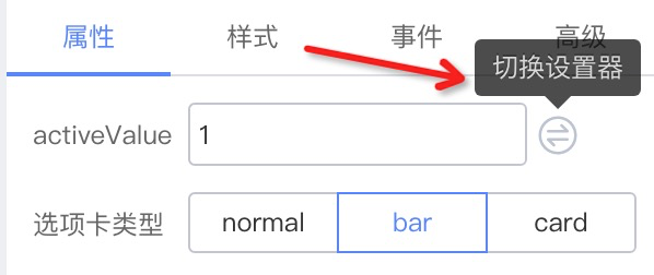
After configuration, a "Switch setter" action item appears.

Enable Component Style Configuration
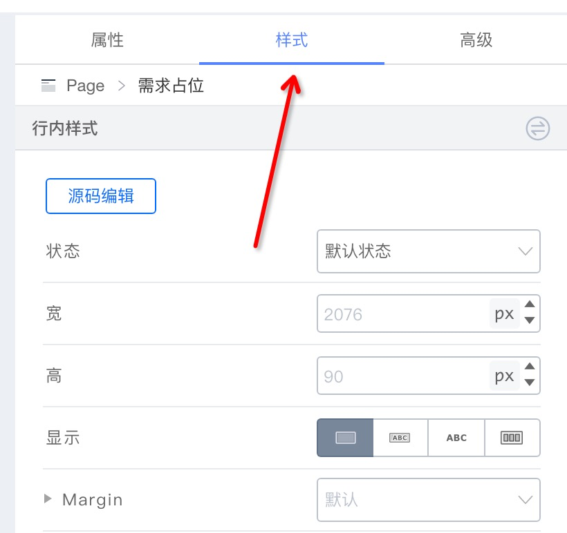
{
  configure: {
    // ...,
    supports: {
      style: true,
    },
    // ...
  }
}
Set Default Component Events
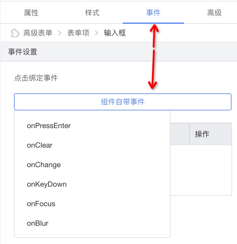
{
  configure: {
    // ...
    supports: {
      events: ['onPressEnter', 'onClear', 'onChange', 'onKeyDown', 'onFocus', 'onBlur'],
    },
    // ...
  }
}
Set Prop Title Tips

{
  name: 'label',
  setter: 'StringSetter',
  title: {
    label: {
      type: 'i18n',
      zh_CN: 'Label text',
      en_US: 'Label',
    },
    tip: {
      type: 'i18n',
      zh_CN: 'prop: label | description: Label text content',
      en_US: 'prop: label | description: label content',
    },
  },
}
Configure How a Prop's Setter Is Displayed in the Configuration Panel
inline

{
  configure: {
    props: [
      {
        description: 'Label text',
        display: 'inline',
      },
    ];
  }
}
block

{
  configure: {
    props: [
      {
        description: 'Advanced',
        display: 'block',
      },
    ];
  }
}
accordion

{
  configure: {
    props: [
      {
        description: 'Form item config',
        display: 'accordion',
      },
    ];
  }
}
entry

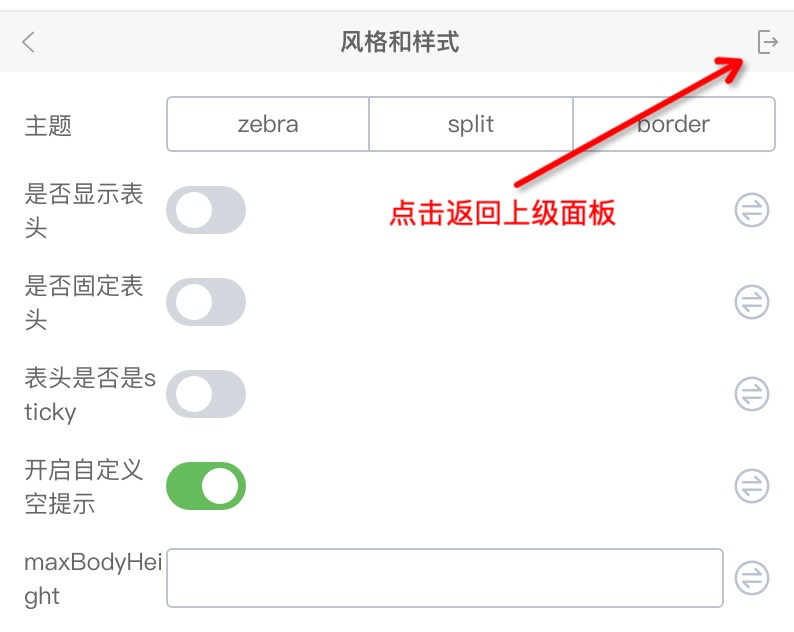
{
  configure: {
    props: [
      {
        description: 'Style',
        display: 'entry',
      },
    ];
  }
}
plain
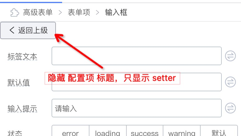
{
  configure: {
    props: [
      {
        description: 'Go back',
        display: 'plain',
      },
    ];
  }
}
Advanced Configuration
Component's children Property Accepts ReactNode
For example, consider a Tab component where each TabPane's children is a component.

Simply add the isContainer configuration:
{
  // ...
  configure: {
    // ...
    component: {
      // New: mark as container so components can be dropped in
      isContainer: true,
    },
  }
}
If you want to allow only Table, Button, and similar content to be dragged into TabPane, configure the whitelist childWhitelist:
{
  // ...
  configure: {
    // ...
    component: {
      isContainer: true,
      nestingRule: {
        // Whitelist of components allowed to drop in
        childWhitelist: ['Table', 'Button'],
        // Likewise, you can set which parent components this component may be dropped into
        parentWhitelist: ['Tab'],
      },
    },
  },
}
Non-children Properties Accept ReactNode
This requires using SlotSetter to enable slots. In the example below, a slot is enabled for Tab's title, allowing components to be dragged in.

{
  // ...
  "configure": {
    "isExtend": true,
    "props": [
      {
        "title": "Tab Title",
        "name": "title",
        "setter": {
          "componentName": "MixedSetter",
          "props": {
            "setters": ["StringSetter", "SlotSetter", "VariableSetter"]
          }
        }
      }
    ]
  }
}
Hide Component Action Buttons in the Designer
Normally, components allow copying:

To disable component copy behavior:
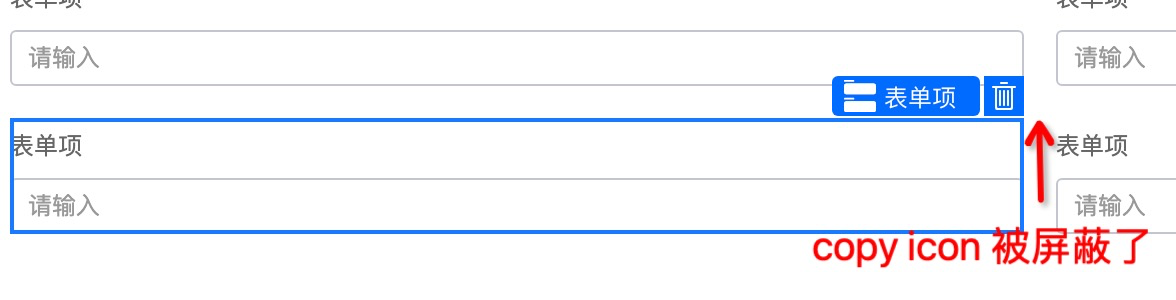
{
  configure: {
    component: {
      disableBehaviors: ['copy'],
    },
  },
}
Implement a BackwardSetter

{
  name: 'back',
  title: ' ',
  display: 'plain',
  setter: BackwardSetter,
}

// BackwardSetter
import { SettingTarget, DynamicSetter } from '@rchh/lowcode-types';
const BackwardSetter: DynamicSetter = (target: SettingTarget) => {
  return {
    componentName: (
      <Button
        onClick={() => {
          target.getNode().parent.select();
        }}
      >
        <Icon type="arrow-left" /> Go back
      </Button>
    ),
  };
};
Advanced Configuration
Hide a Prop Configuration
- Always hide the current prop
{
  // Always hide the current prop config
  condition: () => false,
}
- Show/hide the current prop based on other prop values
{
  // Show the current prop config when direction is hoz
  condition: (target) => {
    return target.getProps().getPropValue('direction') === 'hoz';
  };
}
Prop Linkage
// Dynamically set other props' values from the current prop value
{
  name: 'labelAlign',
  // ...
  extraProps: {
    setValue: (target, value) => {
      if (value === 'inset') {
        target.getProps().setPropValue('labelCol', null);
        target.getProps().setPropValue('wrapperCol', null);
      } else if (value === 'left') {
         target.getProps().setPropValue('labelCol', { fixedSpan: 4 });
         target.getProps().setPropValue('wrapperCol', null);
      }
      return target.getProps().setPropValue('labelAlign', value);
    },
  },
}
// Set the current prop value from other props' values
{
  name: 'status',
  // ...
  extraProps: {
    getValue: (target) => {
      const isPreview = target.getProps().getPropValue('isPreview');
      return isPreview ? 'readonly' : 'editable';
    }
  }
}
Dynamic Setter Configuration
Through the target passed to DynamicSetter, you can obtain some data exposed by the engine—for example, which components are loaded into the engine. Use this data as options for SelectSetter and let the user choose:
{
  setter: (target) => {
    return {
      componentName: 'SelectSetter',
      props: {
        options: target.designer.props.componentMetadatas.filter(
          (item) => item.isFormItemComponent).map(
            (item) => {
              return {
                title: item.title || item.componentName,
                value: item.componentName,
              };
            }
          ),
        ),
      },
    };
  }
}