Quick Start
Prerequisites
We assume you are reasonably familiar with HTML and JavaScript. Even if you have used other languages before, you should be able to follow this tutorial. We also assume you know basic programming concepts such as functions, objects, arrays, and some of class.
If you want a JavaScript refresher, read this tutorial. Note that we also use some ES6 (newer JavaScript) features. In this guide we mainly use arrow functions, class, let, and const. You can preview ES6 compilation online with the Babel REPL.
Environment setup
WSL (Windows)
On Windows you need WSL for Low-Code Engine development. Install guide ➡️ WSL install guide.
On Windows, every command in this guide should be run in the WSL terminal.
Node
Recommended Node version: 16.18.0.
Check Node version
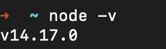
Manage Node versions with n
You can install n to manage and switch Node versions.
Install n
npm install -g n
Switch Node version
n 14.17.0
React
Low-Code Engine extensions are built with React. Having some React background before continuing is recommended. React learning guide ➡️ React Getting Started.
Download the Demo
Clone the DEMO from GitHub (https://github.com/alibaba/lowcode-demo) to your machine.
git clone
HTTPS
Requires git
git clone https://github.com/alibaba/lowcode-demo.git
SSH
Requires an SSH key; if you have one configured:
git clone git@github.com:alibaba/lowcode-demo.git
Download Zip
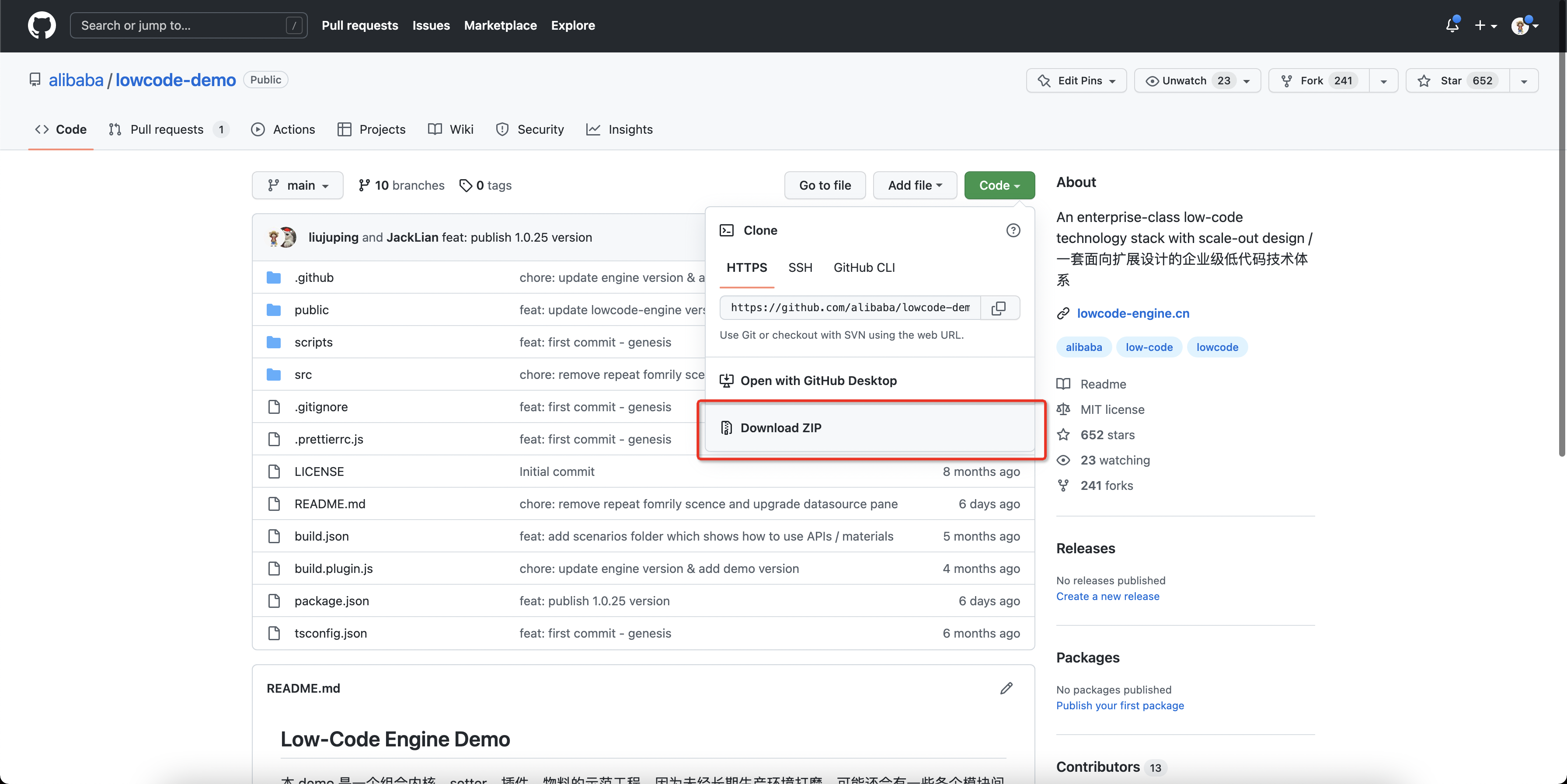
Pick a demo project
Taking demo-general as an example:
cd demo-general
Install dependencies
Under lowcode-demo/demo-general run:
npm install
Start the demo
Under lowcode-demo/demo-general run:
npm run start
Then open http://localhost:5556/ to use the DEMO.
Understanding the Demo
Our Demo is a low-code platform designer. It is the most important part of a low-code platform: users drag, configure, and write code here to build a page. Because audiences, scenarios, and requirements differ, the features of this page vary.
Remember the word designer — it refers to the page below; you will see it often.

Scenarios

The Demo is split into the following 8 scenarios based on the materials each designer needs:
- General scenario
- Basic Fusion components
- Basic Fusion components + one custom component
- Basic Ant Design components
- Custom engine initialization
- Extended node action items
- Advanced form low-code materials based on Next
- Ant Design advanced components + Formily form components
Open different scenarios to see which materials they use.

Directory layout
Each demo-xxx-xxx directory under the repo is a standalone demo project corresponding to the scenarios above.

Directory layouts across scenarios are similar; here we focus on the general scenario.
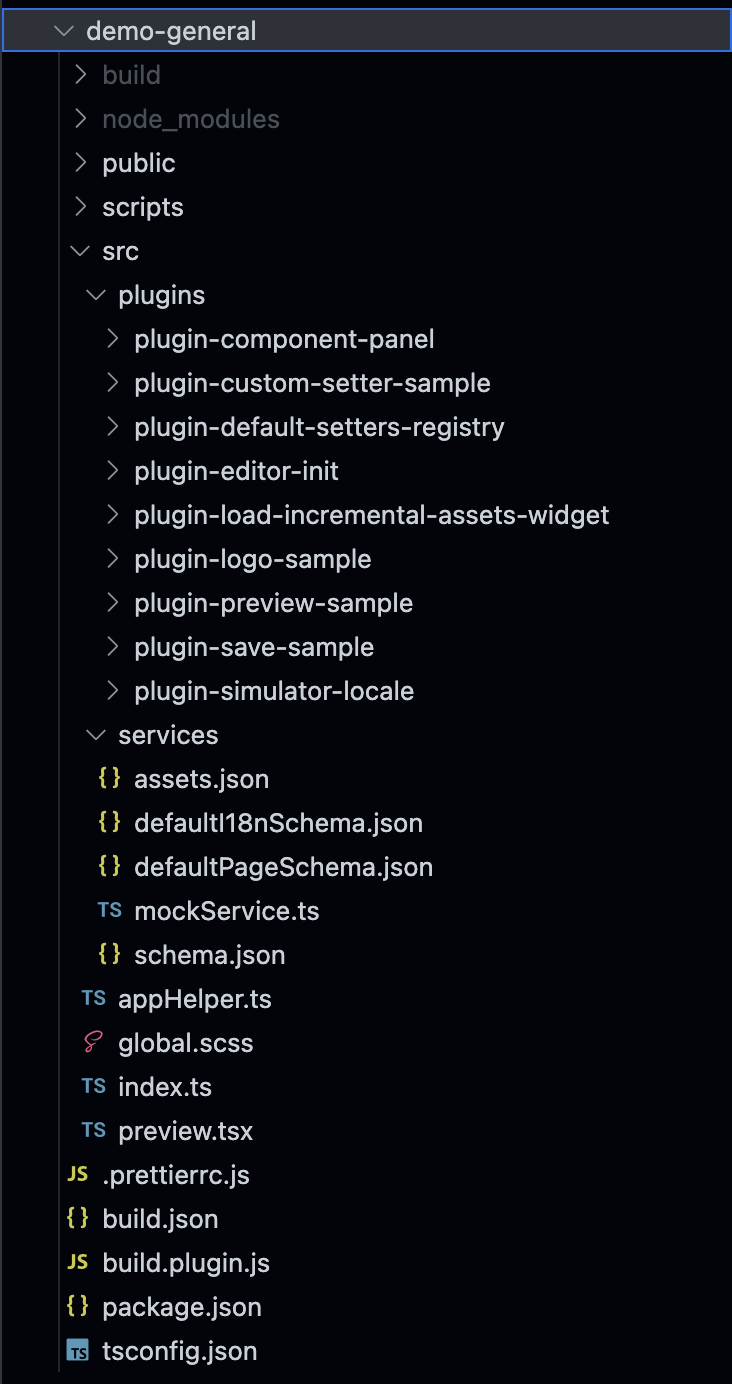
Main pieces:
- Designer entry
src/index.tsdoes the following:- Registers plugins via
plugins.register, including official plugins (published npm packages) and sample plugins underplugins - Initializes the low-code designer via
init
- Registers plugins via
pluginsdirectory — sample plugins so you can see how a plugin is implementedservicesdirectory — mocks data requests and provides default schema and asset packages; in a real project replace these with real server integrations- Preview page entry
preview.tsx
You can learn more from the source.
After that, the low-code designer already has basic capabilities — like what we saw at the start.
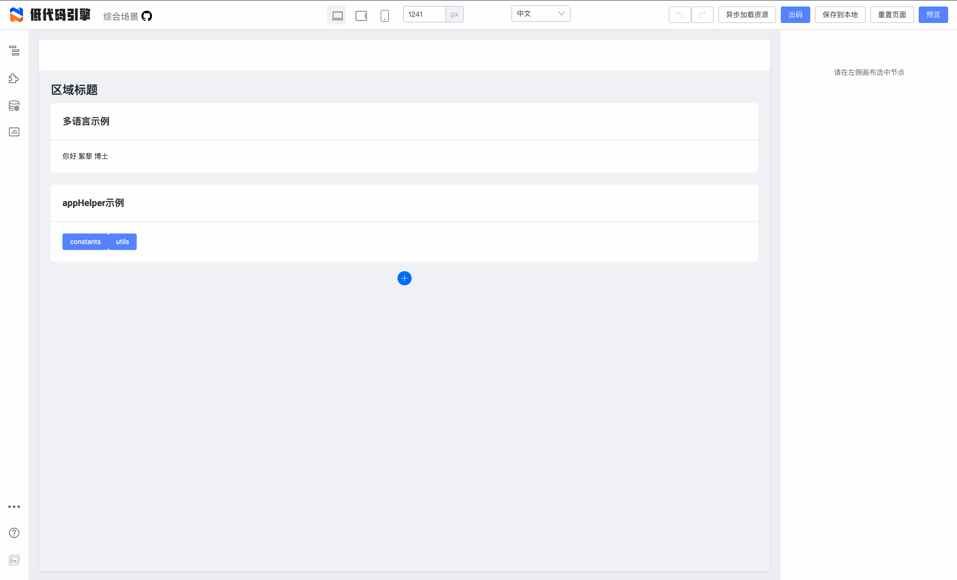
Next, extend the designer to match the features you need.
Developing a plugin
Approach 1: Add a plugin directly in the DEMO

You can add a plugin under demo/sample-plugins. Here the new plugin directory is plugin-demo. Add an index.tsx and paste the following:
import * as React from 'react';
import { IPublicModelPluginContext } from '@rchh/lowcode-types';

const LowcodePluginPluginDemo = (ctx: IPublicModelPluginContext) => {
  return {
    // Data and methods exposed by the plugin
    exports() {
      return {
        data: 'You can expose plugin data like this',
        func: () => {
          console.log('Same for methods');
        },
      };
    },
    // Plugin init; called immediately after the engine initializes
    init() {
      // You can access methods and properties exposed by other plugins
      // const { data, func } = ctx.plugins.pluginA;
      // func();

      // console.log(options.name);

      // Add a panel to the engine
      ctx.skeleton.add({
        area: 'leftArea',
        name: 'LowcodePluginPluginDemoPane',
        type: 'PanelDock',
        props: {
          description: 'Demo',
        },
        content: <div>This is a Demo panel</div>,
      });

      ctx.logger.log('Log a message');
    },
  };
};

// Plugin name; unique in the registration environment
LowcodePluginPluginDemo.pluginName = 'LowcodePluginPluginDemo';
LowcodePluginPluginDemo.meta = {
  // Dependent plugins (array of plugin names)
  dependencies: [],
  engines: {
    lowcodeEngine: '^1.0.0', // Requires engine ^1.0.0
  },
};

export default LowcodePluginPluginDemo;
Add the following in src/index.ts:
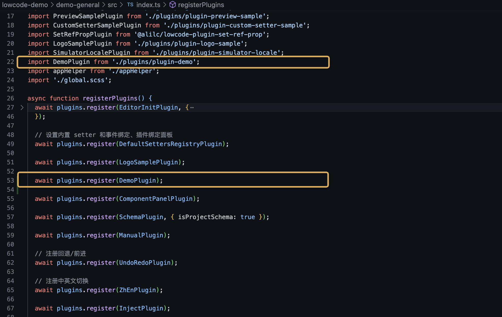
This adds a Demo panel to the designer.

Approach 2: Develop the plugin in a new repository
Initialize
npm init @rchh/element your-plugin-name
Choose designer plugin (plugin)

Complete the prompts
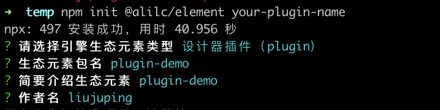
The plugin project is initialized

Install dependencies in the plugin project
npm install
Start the project
npm run start
Debug the project

Debug in the Demo
Add "inject": true under build.json to debug on https://lowcode-engine.cn/demo/demo-general/index.html?debug.

Developing a custom material
Initialize the material
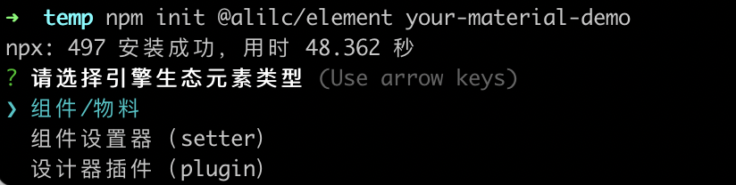
npm init @rchh/element your-material-demo
Choose component/material
Configure the other options
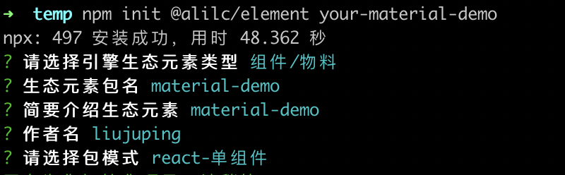
You now have a React material initialized.

Start and debug the material
Install dependencies
npm i
Start
npm run lowcode:dev
Open http://localhost:3333/ to see the material under development.
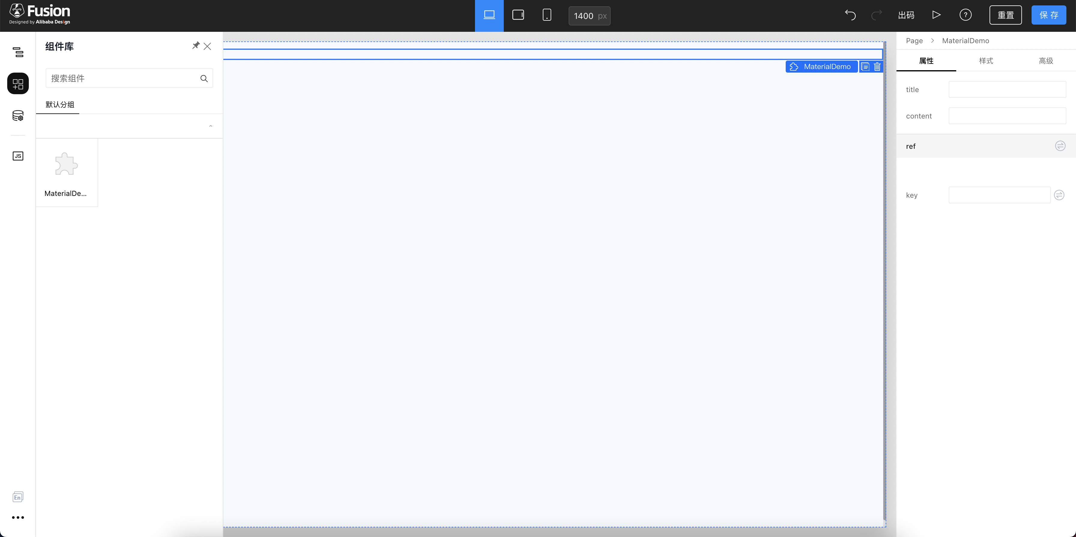
Debug in the Demo
npm i @rchh/build-plugin-alt
Edit build.lowcode.js

As shown, add:
[
  '@rchh/build-plugin-alt',
  {
    type: 'component',
    inject: true,
    library,
    // Page to open; in inject debug mode the browser will not open if this is omitted
    // You can point at the official demo: https://lowcode-engine.cn/demo/index.html
    openUrl: 'https://lowcode-engine.cn/demo/index.html?debug',
  },
],
Restart the project and you can find your custom component in the Demo.
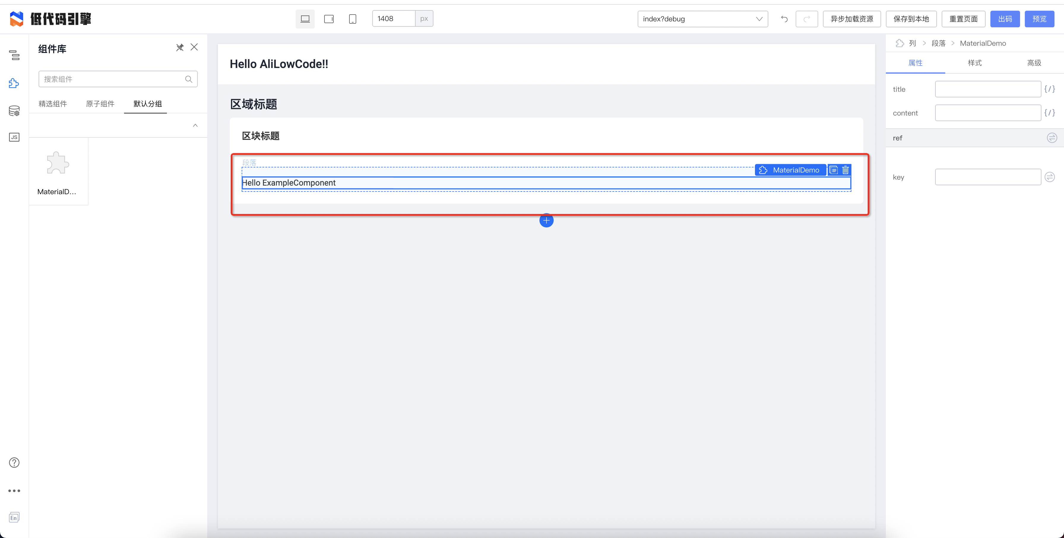
Publish
Build first
npm run lowcode:build
Publish the component
npm publish
The component published here is my-material-demo. After publish you get two important files:
- Low-code description: https://unpkg.com/my-material-demo@0.1.0/build/lowcode/meta.js
- Component code: https://unpkg.com/my-material-demo@0.1.0/build/lowcode/render/default/view.js
You can also find the asset package description at https://unpkg.com/my-material-demo@0.1.0/build/lowcode/assets-prod.json.
{
  "packages": [
    {
      "package": "my-material-demo",
      "version": "0.1.0",
      "library": "BizComp",
      "urls": [
        "https://unpkg.com/my-material-demo@0.1.0/build/lowcode/render/default/view.js",
        "https://unpkg.com/my-material-demo@0.1.0/build/lowcode/render/default/view.css"
      ],
      "editUrls": [
        "https://unpkg.com/my-material-demo@0.1.0/build/lowcode/view.js",
        "https://unpkg.com/my-material-demo@0.1.0/build/lowcode/view.css"
      ],
      "advancedUrls": {
        "default": [
          "https://unpkg.com/my-material-demo@0.1.0/build/lowcode/render/default/view.js",
          "https://unpkg.com/my-material-demo@0.1.0/build/lowcode/render/default/view.css"
        ]
      },
      "advancedEditUrls": {}
    }
  ],
  "components": [
    {
      "exportName": "MyMaterialDemoMeta",
      "npm": {
        "package": "my-material-demo",
        "version": "0.1.0"
      },
      "url": "https://unpkg.com/my-material-demo@0.1.0/build/lowcode/meta.js",
      "urls": {
        "default": "https://unpkg.com/my-material-demo@0.1.0/build/lowcode/meta.js"
      },
      "advancedUrls": {
        "default": [
          "https://unpkg.com/my-material-demo@0.1.0/build/lowcode/meta.js"
        ]
      }
    }
  ],
}
Use it
Put the contents of the published component's assets-prod.json into the demo's src/universal/assets.json.
Prefer appending at the end to avoid errors from resource load order.
As shown, add the packages config

As shown, add the components config
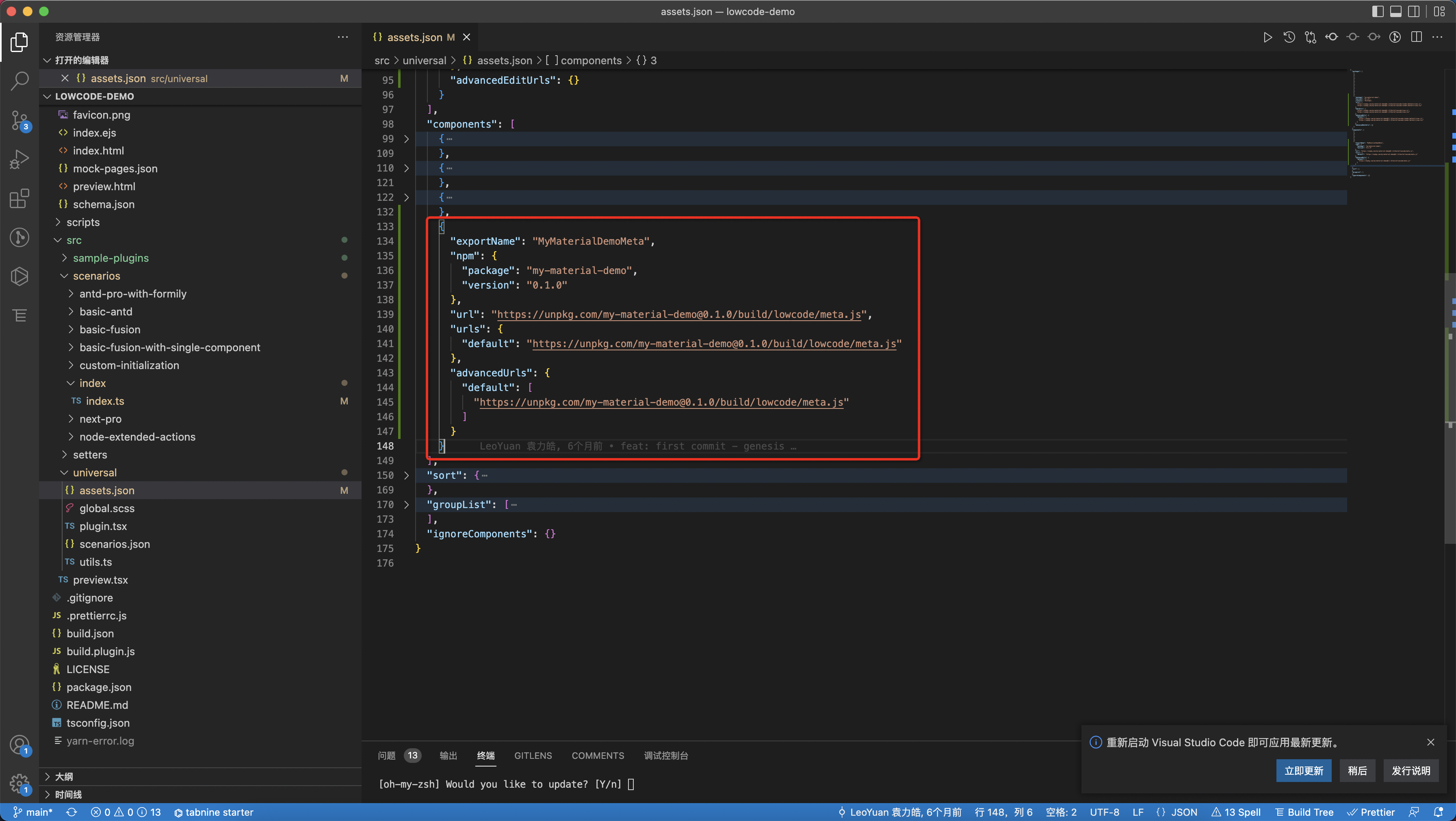
Restart the DEMO and the new low-code material appears. Continue extending materials as needed.
Summary
This is a brief introduction to basic Low-Code Engine capabilities and how to extend the low-code DEMO with new features. There is much more to explore.