React Component Import
Introduction
When building low-code application platforms with the Low-Code Engine, a main challenge is how to quickly and cost-effectively integrate existing React components. This breaks down into two sub-problems:
- How to configure material descriptions for existing components,
- How to build an asset bundle (Assets) that the low-code engine can recognize.
Our product Parts helps solve this problem. We complete material description configuration through an online visual interface and provide one-click packaging to generate asset bundles the engine can recognize.
Import Materials
First, import materials for online material description configuration on the Material Management page.

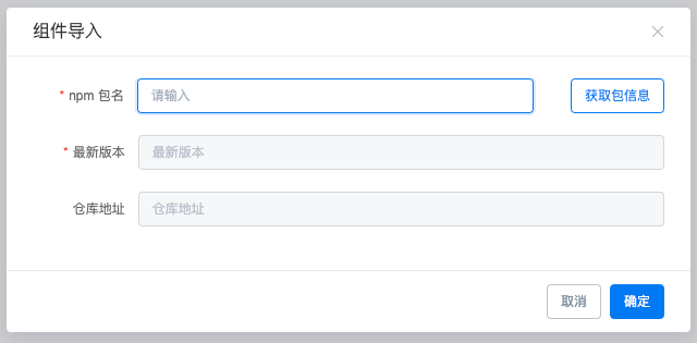
- Click the Import Existing Material button at the top-left of the list
- Enter the npm package name in the dialog
- Click Get Package Info to fetch basic npm package information
- Click Confirm to complete import
Configuration Management
Step 2: After importing materials, you can add material description configuration for imported materials. Click Component Configuration on the right to start configuring.

Add Configuration
- Click Add Configuration at the top-right of configuration management
- Select the component version
- Fill in the component path, usually the same as the
mainfield in the npm package'spackage.json(if incorrect, rendering will fail later) - The description field adds notes for this configuration.
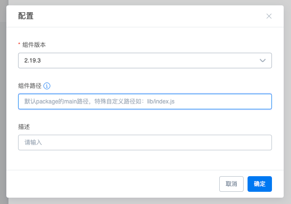
To reduce configuration cost, the first time you add configuration, component code is automatically parsed to generate an initial component material description. Wait briefly for code parsing. After parsing completes, click the configuration button to enter the online configuration interface.

Component Description Configuration
The operation interface is shown below. The specific configuration flow follows.

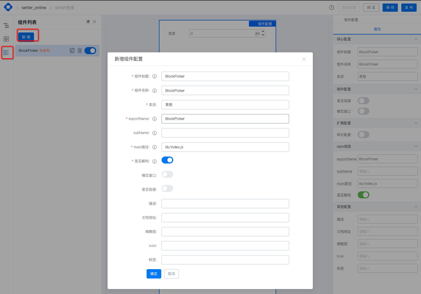
Add Component
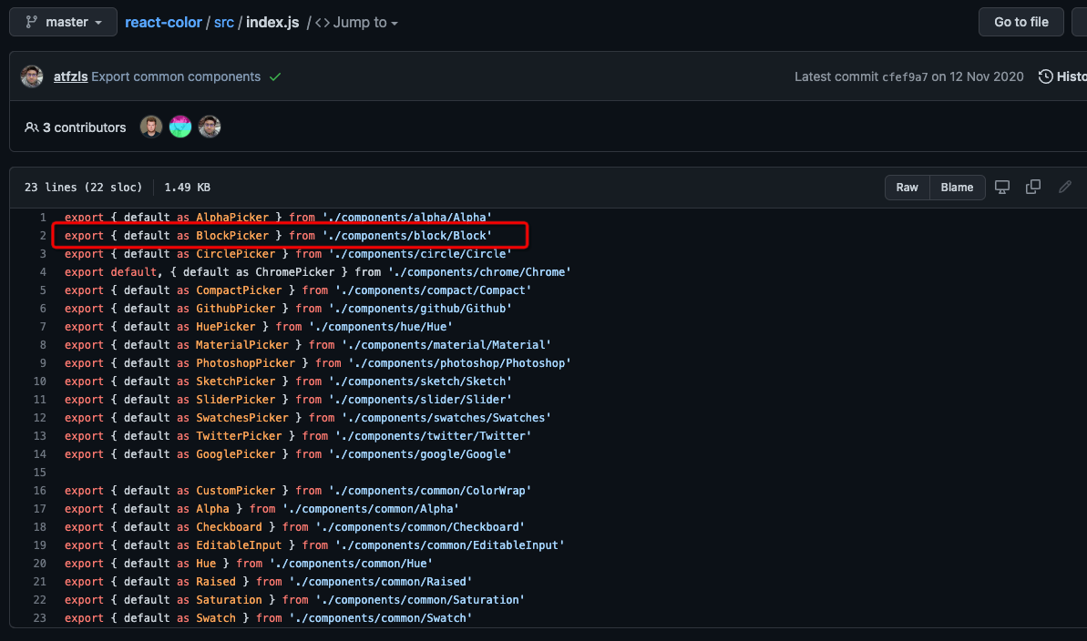
If automatic code parsing fails during new configuration, or the parsed component list does not meet development requirements, click the Add button in the left component list plugin to add a new component. Refer to the field hints. Example using react-color:
Add Material Description to Component
- Open the left Setter panel
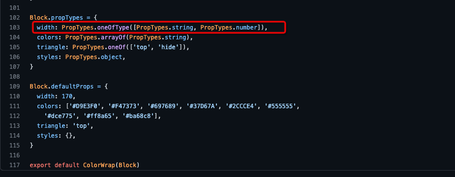
- Drag the required Setter type for each component property (e.g., for the
widthproperty in the image, drag in Number Setter) - See Built-in Setter List for Setter introductions
- Configure basic property information (as shown)
- Click Save at the top-right when done

Advanced Configuration (Property Linkage)
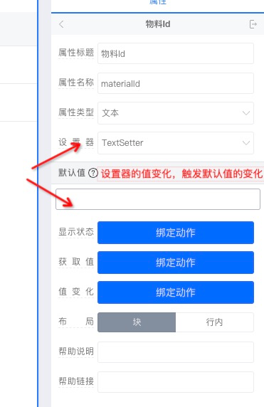
Example: When the "Setter" configuration item's value is modified, the "Default Value" below should change accordingly.
How to use
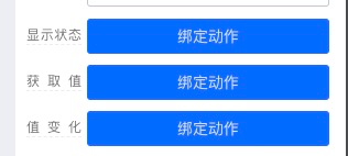
Component property configuration currently supports three basic linkage functions:
- Display state: Returns
true|false. Returnstrueto show the configuration during setup; otherwise hidden. - Get value: Triggered when the configuration node's
getValuemethod is called - Value change: Triggered when the configuration node's
setValuemethod is called
The first parameter of each method is the current configuration node object. Commonly used methods include:
getValue(): Get the current node's value;undefinedif the current node is a child nodesetValue(): Set the current node's value if the current node is a child nodeparent: Current node's parent nodegetPropValue(propName): Parent gets a child node's property value;propNameis the child property namesetPropValue(propName, value): Parent sets a child node's property value;propNameis the child property name,valueis the value to setgetConfig: Get the current node's configuration, such as title, setter, etc.
Debug Material Description
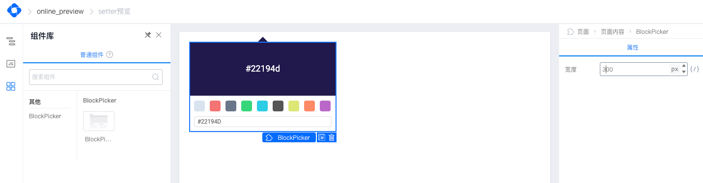
Click the Preview button at the top-right to debug the properties you just configured. For first-time component preview, there is a component build process (building the UMD package). After the build completes, you can debug your configuration.
Publish Material Description
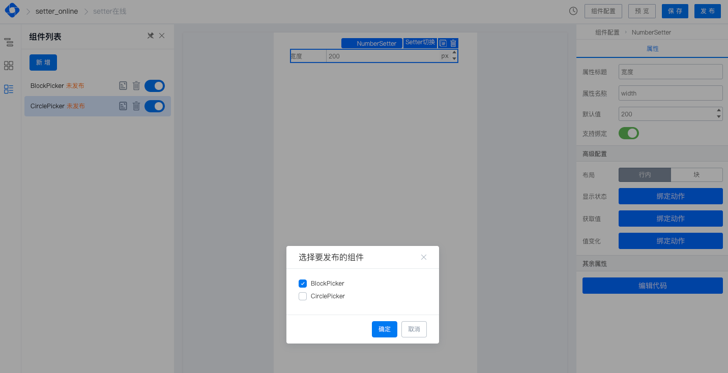
After material description debugging is complete, you can use it in your project. Publish the material description first.
- Click the Publish button at the top-right
- Select components to publish
- Click Confirm to complete publishing
Asset Bundle
Step 3: After material description publishing, build a usable asset bundle for low-code applications.
Asset Bundle Build
There are two ways to build an asset bundle:
Use the My Asset Bundles asset bundle management module for full lifecycle management, including building. See Asset Bundle Management
Use Asset Bundle Build in the My Materials component management module:
- Select components to build
- Click the build asset bundle button
- Select the material description configuration you just created
- Start the build. When complete, you get a JSON file (containing material descriptions and UMD packages) ready for use in your project
Using the Asset Bundle
See Asset Bundle Management for details.
Contact Us