SlotSetter
Overview
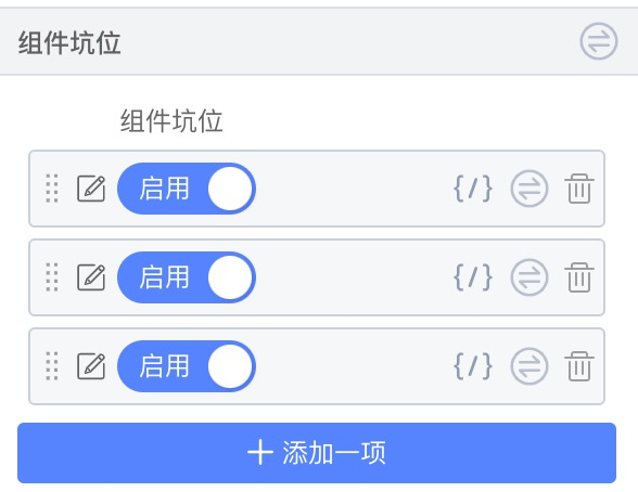
By enabling a slot, you can render one or more nodes at a specific location in a material. Slots are well suited for localized custom rendering in materials.
Display
Setter Configuration
| Property | Type | Description |
|---|---|---|
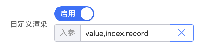
| initialValue | Object | Default value: { "type": "JSSlot", "params": [ "module" ], "value": [] }. params: function parameters passed to the slot; can be consumed directly in slot nodes via this.module (where module is an example — change it to match your actual function parameters). value: defines a node that is filled in by default each time the slot is opened. |
| hideParams | boolean | Whether to hide parameter inputs. Note: this only hides the parameter input fields (suitable for single-line display). At render time, params are still passed — unlike params: []. |
| checkedText | string | Switch label when enabled. Default: "Enable" |
| unCheckedText | string | Switch label when disabled. Default: "Disable" |
Configuration Example
Configuration
{
    name: 'propName',
    title: 'propTitle',
    setter: {
      componentName: 'SlotSetter',
      isRequired: true,
      title: 'Component slot',
      initialValue: {
        type: 'JSSlot',
        value: [],
      },
    }
  }
Component
function A(props) {
  return props.propName;
}
Parameterized Slot Example
Configuration
{
  name: 'propName',
  title: 'propTitle',
  setter: {
    componentName: 'SlotSetter',
    isRequired: true,
    title: 'Component slot',
    initialValue: {
      type: 'JSSlot',
      params: [ 'module'],
      value: [],
    },
  }
}
Component
The component must receive parameters for rendering — usage differs from the basic example.
function A(props) {
  const module = [];
  return props.propName(module);
}
Param Usage Example
- Enable the slot
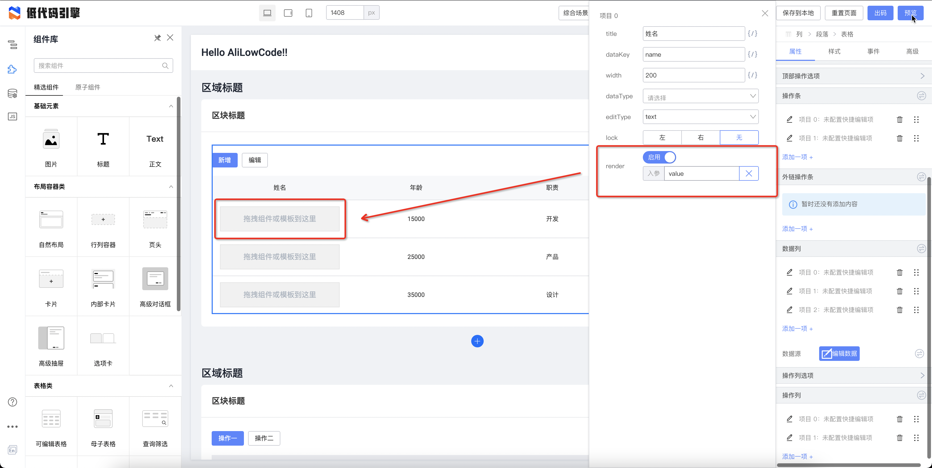
- Drag components into the slot
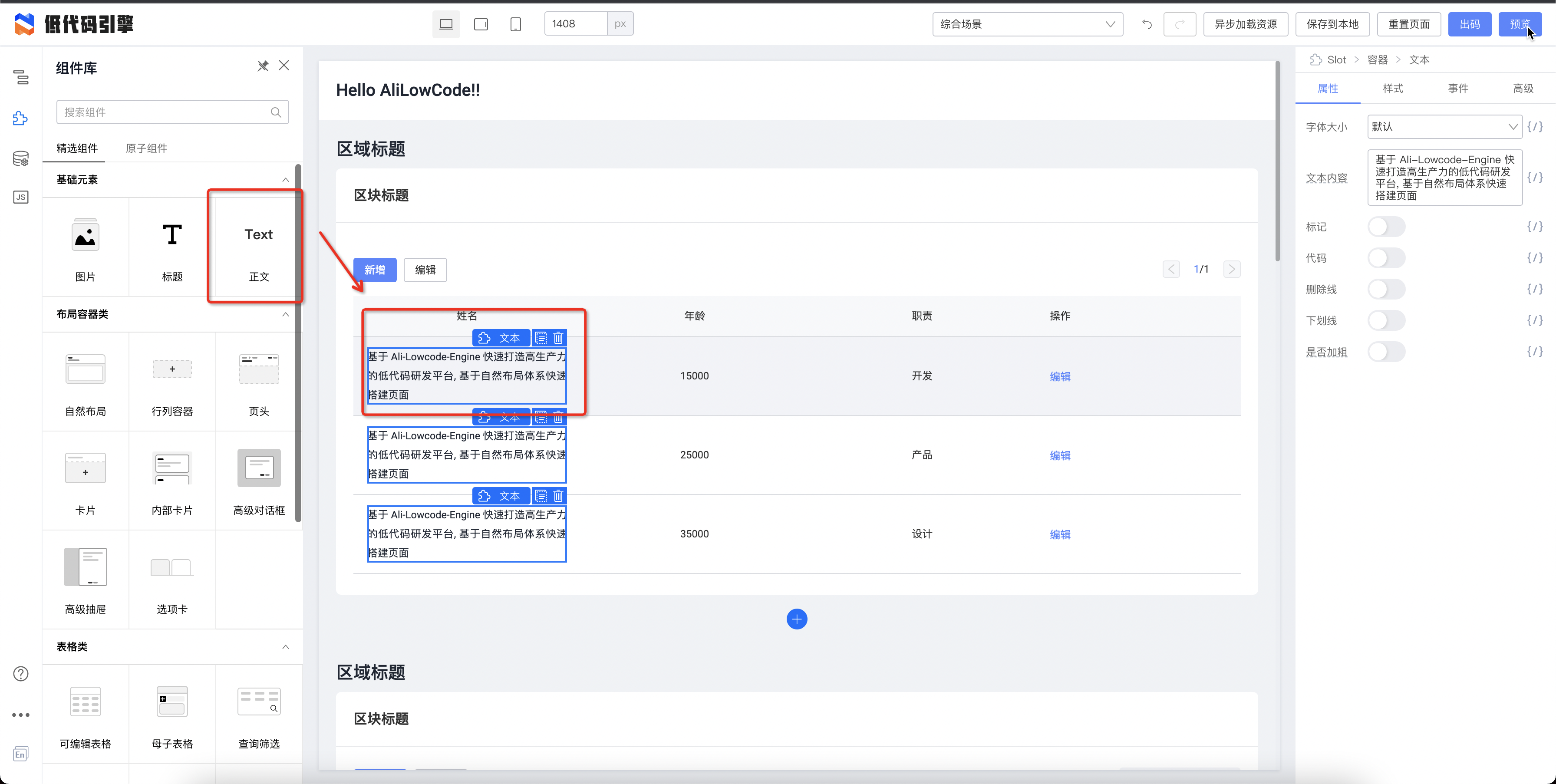
- Use variable binding inside slot components — bind to
this.xxx
Parameter configuration for xxx